Week 1 | Temporary expert: Bioremediation

Assigned topic: Bioremediation

Humans have done a lot to pollute the world we live, contaminating soil and water with everything from oil to radioactive waste. Some parts of nature have evolved to survive pollution and might even be able to help clean up these contaminants.

Using living organisms to get rid of toxic waste is called bioremediation, which is a relatively safe and cost efficient process. The most common bioremediator is bacteria however certain plants and animals can help too.

Bioremediation is defined as a process that uses microorganisms or their enzymes to treat polluted sites for regaining their original condition (Glazer and Nikaido, 1995). Bioremediation approaches are generally classified as in situ or ex situ.

In situ bioremediation can be described as the process whereby pesticides are biologically degraded under natural conditions to either carbon dioxide and water or an attenuated transformation product. It is a low cost, low maintenance, environment-friendly, and sustainable approach for the clean-up of contaminated soils (Megharaj et al., 2011). For ex situ bioremediation, contaminated soils have to be excavated and moved to another site for treatment, which may result in a high cost. Therefore, considering the large scale of agricultural land, in situ bioremediation is preferred to ex situ remediation for restoration of contaminated agricultural soils.

References:

https://www.youtube.com/watch?v=c2pQ9guh27s

https://www.sciencedirect.com/topics/agricultural-and-biological-sciences/bioremediation

https://www.sciencedirect.com/topics/earth-and-planetary-sciences/bioremediation

https://www.sciencedirect.com/book/9780128161555/integrated-analytical-approaches-for-pesticide-management

https://www.sciencedirect.com/book/9780128000212/microbial-biodegradation-and-bioremediation#book-info

Live Web Assignment 1: Self Portrait

For this week’s assignment the main goal was to practice “add event listener” and “get element by id” by creating a self portrait with video and audio implementation in javascript. I started the process by finding a video that would represent myself in a good way and the project evolved from there.

The first functionality that I focused on was to be able to play the video on the screen, and I added a button to play and pause with toggle functionality. After I was able to implement those interactions I decided to try to change the text that was being displayed on the button, this was for sure the most difficult part of the assignment because I had to do research in many different elements that I wasn’t used to implement.

The next step was to apply some styles using css, I didn’t want to invest too much time on that because I wanted to focus on practicing more javascript therefore the visual components are simple.

Moreover, I wanted to find a way to only show the video when the button was pressed and change the background image when the video was playing and at the same time enable the functionality to hide the video and the background image, but making sure that the video was paused while it was hidden.

The final result is a self portrait that demonstrates in a very accurate way how happy I get whenever I have ice cream in my hands.

Code documentation:

Data Sketches

For the first assignment of the semester the intention was to start interacting with data sets and find a way to visually display the information. I decided to work with a .JSON file since it is a data structure that I understand and I felt more comfortable with. For this week I wanted to focus on understanding the data structure and how to navigate throw it. I also spend some time analyzing which p5.js elements I could use in order to create three different visualization of the information.

For the first proposal I used the base of data over time with the map functionality to display the years in the x axis and the ring width in the y axis, at the same time I wanted to create a visual comparison between the ring width and the growth index, therefore I displayed them in different colors and joint them with a 1px line.

The use of contrast to differentiate the main data point (ring width) vs the secondary data point (growth index) was achieved by using different colors and sized to the elements. I used rectangles with rounded corners in order to display the information.

Proposal 1: Ring Width vs Growth Index over time.

Proposal 1: Ring Width vs Growth Index over time.

For the second proposal I decided to continue working with the same distribution of the years and ring width however this time I wanted to try different contrast in the same elements, opacity and shape in order to create visual focus on the primary elements and display in the background the secondary data point as a point of reference. The problem faced with this visualization is that the only data points that can be shown in the secondary layer of information are the years in which the growth index was higher than the ring width, however I believe this exploration worked as a way to understand in which cases opacity and layering information can be useful or in which cases it might hide important information for the viewer.

Proposal 2: Ring Width vs positive Growth Index over time.

Proposal 2: Ring Width vs positive Growth Index over time.

In the third proposal I decided to explore the concept of rings, I wanted to show the growth over time in a concentric way. I used the arc element in p5.js in order to achieve that. Once I was able to create an arc for each year (in the x axis) with it’s corresponding ring width (the height of each arc) I decided to use the mapping function in order to change the color and the stroke weight as the years pass. This is definitely a more abstract way of representing the data but it was interesting as a visual exploration of the possibilities with the same dataset.

Proposal 3: Years and Ring Width

Proposal 3: Years and Ring Width

Technical details:

Code for proposal 1

Code for proposal 1

Code for proposal 2

Code for proposal 2

Code for proposal 3

Code for proposal 3

Quantifying Humanist Final Project: Quantifying my Guilt

For my final project of Quantified Humanists I wanted to collect, analyze and visualize data related to triggers of my emotional misbalance during the semester, I started by trying to quantify the quality of my meals, the exercise that I did and the guilt that I felt every time that I ate something unhealthy or I didn’t exercise.

At the very beginning of the project I realized that I wasn’t actually interested in counting how many days did I exercise or how healthy my meals were, instead I was interested in the emotional impact that those moments had in me. Thinking about how I felt every time that I did something “wrong” I realized the Guilt was the common denominator in all of those moments. I started to get interested in understanding why did I feel guilt, how much guilt did I feel and what triggered that guilt. The ultimate goal of that collection was to identify events that have a negative impact in my mental health and being able to mitigate them by finding ways to better deal with my everyday moments of guilt.

The project started with the data collection, in order to have a way to collect that was easy to implement and maintain over time, I created a Google doc, and I installed a shortcut in the home screen of my phone so that I would have easy access to it.

After I finished the data collection process, the Google Form provided me with a preview of the data visualized in a traditional way, I realized immediately that these visualizations were not able to give the the knowledge that I was seeking since they sere individual data points instead of being correlations of information.

I downloaded the data in a .csv file and converted it to a .son so that I could use it as an input to create different graphics using p5.js. The conversion process was important for me to be able to have a well structured data file with all the information collected.

The first step of the design process was to sketch different ways in which the data could be visualized. Depending on the type of data and the correlations that I wanted to make (for example, trigger vs level of guilt) I created different ways of visualizing the data by using alternative graphics, different than just bar-charts or scatter plots.

After I decided which graphics to create and how to better visualize and correlate the information I started the development process in p5.js. I also created a in Sketch in which I defined the typography and the colors that I wanted to use in the sketch.

The final data visualization consists on three different charts and each one of them communicates a specific correlation of the previously collected information. The first chart shows all the individual moments of guilt (40 in total) and the strength (in a scale from 1 to 5) that I felt. I also used different colors to differentiate from each different trigger reason. The second chart shows an average of all the guilt moments by category and the strength to show how different those data points were between different triggers. Finally the third graphic shows the total amount and percentage of moments of guilt by time of the day, in general it is easier to understand that I normally feel more guilty during the night.

Final UI

I hope that this exploration of my feelings is going to help me prevent from having unjustified moments of guilt and hopefully be able to decrease the moments of guilt that I experience during the day and the negative effects in my mental health.

Critical Objects Final Project Proposal

After I presented my project YUZPE: Emergency Contraception for Costa Rica, three days after I read the amazing news that finally, after some time of discussion the government decided to allow the sanitary registration of “the day after pill” in Costa Rica.

I was really happy about it specially since I have beed working on my Critical Objects project related to that topic. I thought that this was the end of my criticism, however, a day after that news were release, the Catholic Church emitted an official position to the news.

Basically the Catholic Church is saying:

“ For the representatives of the Church, the pill is linked to abortion. In addition, they affirmed that they want to accompany these women and their children, show them the greatness of God's love, Lord of life and propose to all people of good will that the solution to the difficulties is not to eliminate the lives of the most defenseless, but to protect basic human rights, starting with the right to life and continuing with the rights to decent work, education, health and safety for women and their children.”

As I mentioned in my previous project, the problem comes from way back, there is no sexual education allowed in the country and children and adolescents don’t have enough resources when it comes to sex-ed which is leading to a big amount of adolescent birth rate. The lower income population is the one that suffer the most from the church and the society position to the issue therefore I would like to work on a Critical Object that speaks directly to this issue.

Topic: Lack of Sexual Education and access to health due to the intervention of the Church and the government in kids and teenager education (subject to change of focus as I do more research).

Group: Since I will continue working with a subject related to Costa Rica I decided to work alone.

Limitations: This is a project for a third world country, therefore there is no universal access to internet and also the population who are more affected by this policies and church intervention are the ones with less income, therefore low income will also be a limitation for my project.

Framework: I would like to stick to the regular design framework that I used for the YUZPE assignment: Research, Concept, Moodboard, Prototype, Testing and Implementation.

YUZPE: Emergency Contraception for Costa Rica

Emergency contraception is something that has been part of women’s lives for a long time in a lot of countries, however in Costa Rica, this is not the reality. My country is very Catholic minded and the politics are mostly dictated by religion, specially when it comes to body politics.

The sexual education is almost non existing, specially in public schools. Teacher are not allowed to talk about sexuality and reproductive health with students and even if they wanted to there is no class or curriculum that allow them to talk about this with their students. The problem goes beyond the classrooms because most of the families are still very close minded which means that children and adolescents (even young adults) don’t have the confidence to talk to their parents about these subjects.

When it comes to contraception methods, the lack of education causes that a lot of young women that are sexually active doesn’t know how to properly prevent a pregnancy, which leads to the fact that in 2016, 14.7 out of 100 new borns were from an adolescent mother (number that was celebrated as the lowest in the history of the country).

Costa Ricans have access to regular contraception pills over the counter, but there is no way to get the emergency contraception pill. No pharmaceutical company has ever register the drug (mostly because the way that the Catholic believes affect the laws and the decision making process in the Congress).

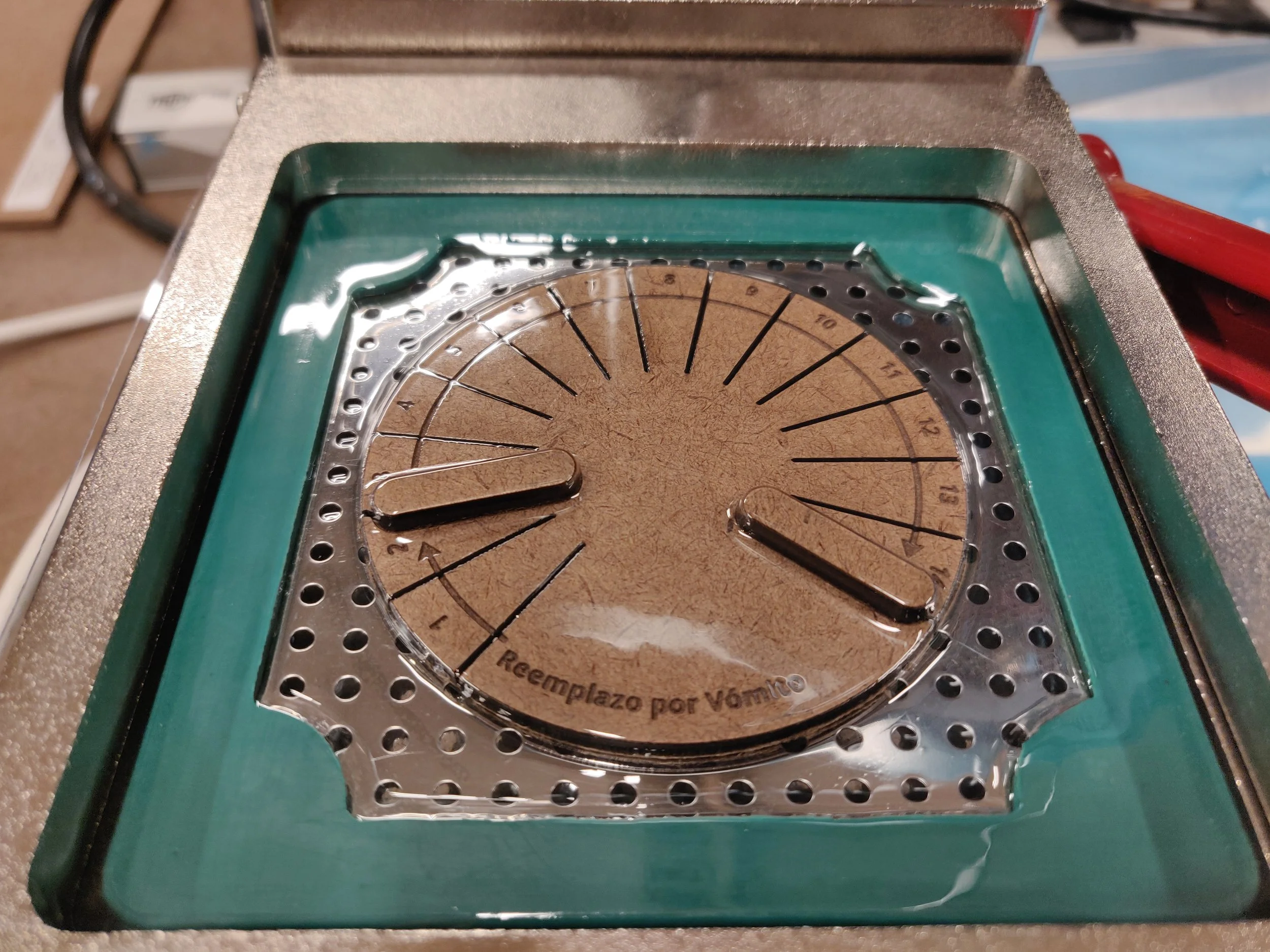
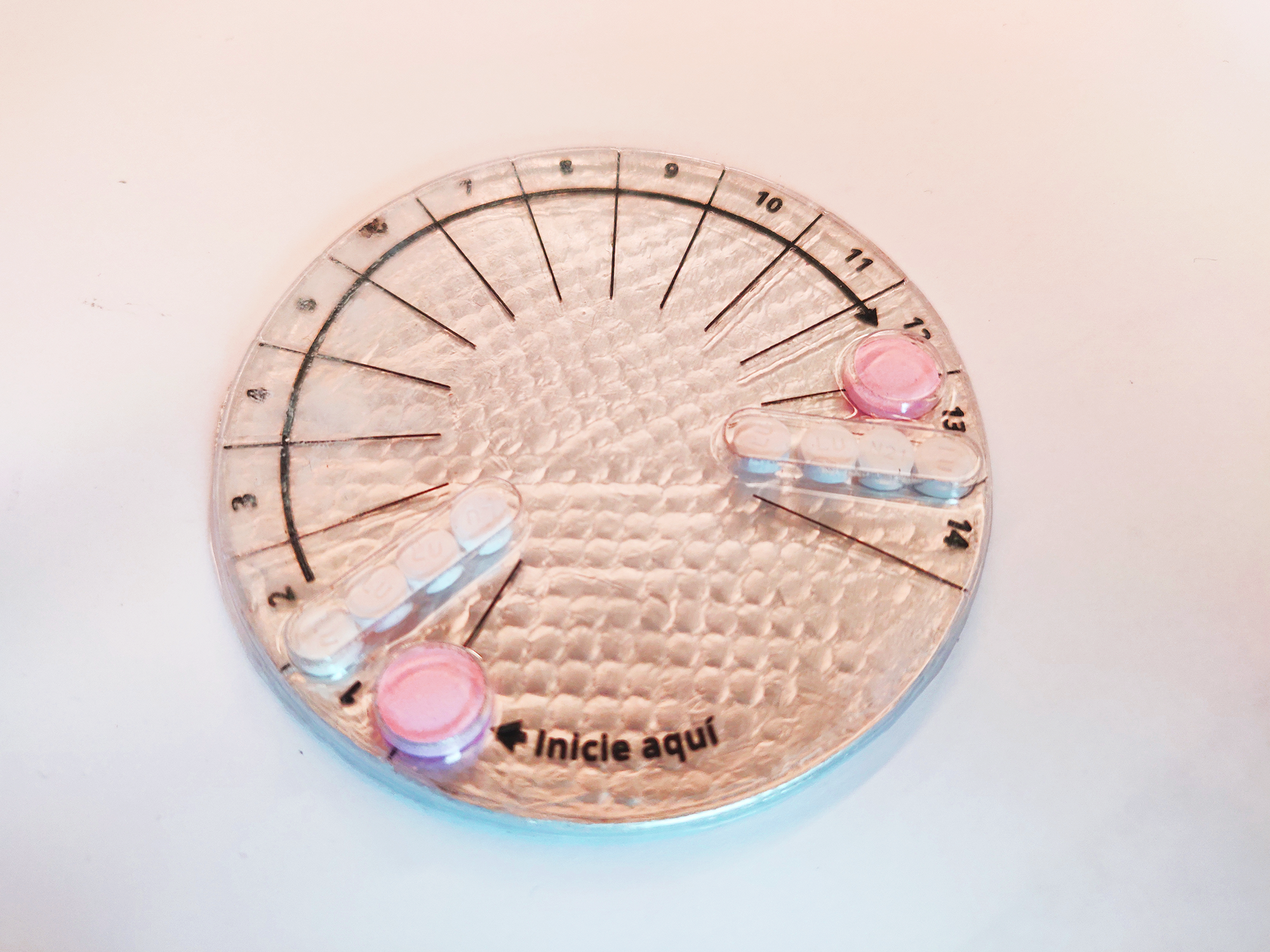
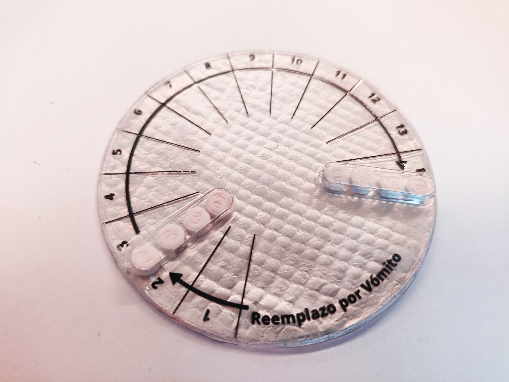
In the 70’s a researcher found a way to have emergency contraception using regular birth control pills: “The Yuzpe regimen is a method of emergency contraception that uses a combination of ethinyl estradiol and levonorgestrel. It is less effective and less commonly used than a larger dose of levonorgestrel alone, a dose of ulipristal acetate, or insertion of a copper intrauterine device”. Because it is possible to buy regular contraception pills over the counter it is possible to do the YUZPE method, however most women doesn’t even know this exist and they have no idea if exist or which kind of pills to buy and how to consume them.

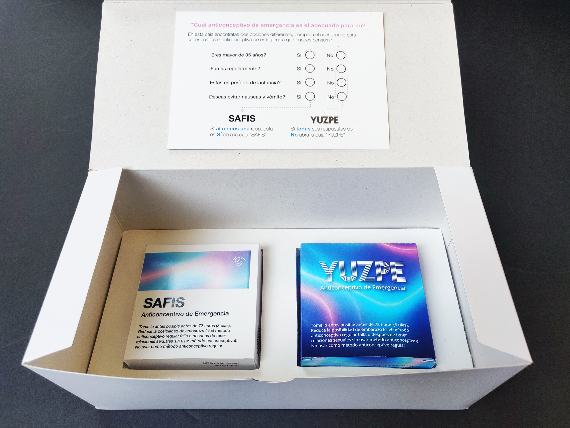
Recently a company tried to finally register the drug, since it is not an abortive pill, the congress has to approve its use, however they are trying to find ways to make it more difficult for women to have access to it, for example, the commercialization of the pill will implicate that a medical prescription will be necessary and also, if it is implemented in the Social Security system, it will be only in cases of rape.

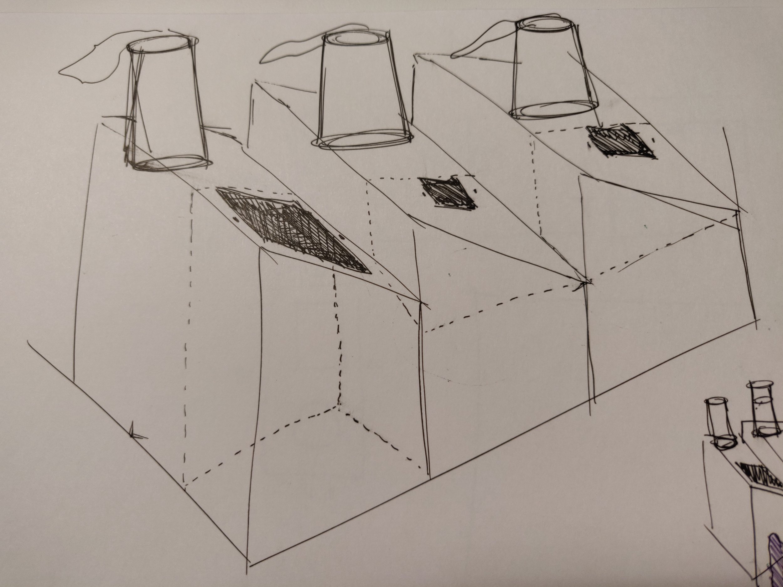
This is the beginning of my Critical Object for body politics. I wanted to create an emergency contraception kit with currently available pills in Costa Rica and an easy guide on how to use it and in which cases it is not possible to use, such as women in lactant periods, women over 35 y/o or women who smoke frequently (this is due the combination of two different hormones, instead of only one like is the case with pills like “Plan B”).

My process started defining the framework to use, starting with the research, mood-board and creating a prototype and finally the Design and Implementation. After I started the research, the sketching of ideas became a very crucial part of my design, I knew that the project was going to heavily rely on layout, graphic design and visual communication therefore I had to make sure that the layout design of the pills blisters was going to be the core of my project.

The next phase was to define a moodboard. I did benchmark research to understand how the packaging design of birth control pills has been done in the past. I also wanted to create a project with a 70’s look and feel to exemplify the fact that the YUZPE method was discovered in the 70’s however there have been a lot of newer findings (one pill that prevent the women from vomiting and allows to be taken by a wider range of the female population), however, in Costa Rica we are still using very old and insecure technique.

Moodboard

The next phase was the fabrication of the prototype. I started by creating the form in the laser cutter, after I defined the layout in Illustrator, I used the Vacuum Former in order to create the pills blisters (3 different ones) that are going to be placed inside a box. The final prototype consisted on 3 different pills blisters, with white paper to indicate the instructions on how to take the pills. The prototyping process allowed me to test and correct the size of the actual pills and quickly iterate in order to have a better final result.

The three blisters consist on:

  • Blister A: The desired scenario of having only one pill with one hormone that causes less nauseas and it is more effective. This blister is empty because we do not have access to this drug in Costa Rica.

  • Blister B: Contains two pink pills (anti motion sickness pills to prevent the women from throwing up) and eight combined (2 hormones) contraceptive pills.

  • Bister C: Since the combination of hormones is heavy for the system, the women is likely to vomit the pills, if this happens before one hour, she has to take them again.

Blister Description

Blister Description

I also designed an instructive on how to consume the pills. The time that the women needs to wait since they take the first wound until the second one is crucial and this information is normally difficult to find, specially it is difficult to visualize in an easy and intuitive way. The visual design was done paying attention to how to effectively communicate how to take the pills and how much time to wait.

The final design of the box and the blisters is a concept of a 70’s themed box that contains all the pills and the necessary information to “legally” practice an emergency contraception in Costa Rica using the YUZPE method.

Final Project | Critical Objects

For the final project I decided to continue working on the same line of the YUZPE pill, I noticed that the criticality of the empty pill was missing and I wanted to improve the design components that lead me to communicate the message in a better way. There were also aspects about the fabrication in the first iteration that I wanted to correct therefore I decided to continue the project.

After I presented my project YUZPE: Emergency Contraception for Costa Rica, three days after I read the amazing news that finally, after some time of discussion the government decided to allow the sanitary registration of “the day after pill” in Costa Rica.

I was really happy about it specially since I have beed working on my Critical Objects project related to that topic. I thought that this was the end of my criticism, however, a day after that news were release, the Catholic Church emitted an official position to the news.

Basically the Catholic Church is saying:

“ For the representatives of the Church, the pill is linked to abortion. In addition, they affirmed that they want to accompany these women and their children, show them the greatness of God's love, Lord of life and propose to all people of good will that the solution to the difficulties is not to eliminate the lives of the most defenseless, but to protect basic human rights, starting with the right to life and continuing with the rights to decent work, education, health and safety for women and their children.”

The group was asked to choose two limitations and a framework:

Limitations: This is a project for a third world country, therefore there is no universal access to internet and also the population who are more affected by this policies and church intervention are the ones with less income, therefore low income will also be a limitation for my project.

Framework: I would like to stick to the regular design framework that I used for the YUZPE assignment: Research, Concept, Moodboard, Prototype, Testing and Implementation.

Emergency Contraception pills
top view
3.png

Midterm: Pollution Inequality Factory

For the midterm assignment I worked with Stefan A Skripak, the first stage of our procvess was to sit together and discuss about a subject that was important for both of us, he have worked together in the past and we already knew that we care about some common issues therefore we started by discussing them. He both care about environmental and also racial problems and Stefan found a Scientific Paper that talks about the inequality of the pollution created vs the pollution received by different racial groups.

In summary the paper indicates that in the US, the white population creates more pollution (by consuming more products and services) than the Black and Latino population, however they receive less pollution (
based on the places where they normally live). At the same time the relationship is in-equal because the Black and Latino population create less population but they receive more.

For the assignment we decided to work with the following constrains:

Device: Incongruity

Attribute: Interactive

Mood: Frustration

We focus specially in the mood frustration because we wanted to be able to display the data by creating an interactive physical data visualization of the percentages extracted from the scientific paper and the frustration we wanted to be able to communicate by creating an unfair or inverse relationship between the action (consumption/creation of pollution) and the result (being affected by the pollution). In essence we knew we wanted to be able to communicate that even though the white population created more, they received less pollution, and make the users feel frustration by this in-equal distribution.

We considered gamification for being able to communicate the frustration in an easier way however we decided not to go for this approach because the intention will never be to encourage the users to create pollution, even if it is in a metaphoric way. We tried different ideas on how to be able to visually represent this unfairness, one of them was to play with gravity and visual illusions but the problem with this approach was the design component of it and how to be able to use metaphors for the consumption and the pollution.

We decided to work with the component of “Air Pollution” and “Plastic consumption” by using inflatable plastic bags based on the fact that we see a lot of plastic bags hanging from trees in NYC and this is something that frustrates us, therefore we wanted to use it in our favor.

Plastic bags on trees
plastic-in-trees.jpg

The next phase of the project was to prepare a quick prototype and materials for the feedback session that we had in the last class, the main goal for us was to test if we were being able to communicate the message correctly and we also wanted to receive feedback on what was the best was to inflate the plastics bags by using the user interaction with the piece and at the same time how to be able to use that interaction in order to imitate the human consumption.

Feedback Session subject and inspiration

Feedback Session subject and inspiration

The first proposal that we took to the class was to activate the fans by pushing buttons with three different timers, we envisioned this being used by 3 users at a time however we didn’t want to gamify the experience, therefore we also sketched some silicone pumps (one bigger than the others to communicate the fact that the white population consume more).

Sketches first proposal

Sketches first proposal

By sharing our Device, Attribute and Mood with the class and explaining our research and our ideas we were able to gather really good feedback and at the same time the location of the dots among the triangle gave us an idea that we were heading in the right direction because most of them were located to the center. We also figured out that the interaction with either the buttons or the silicone pumps was not intuitive and clear enough so we went ahead and continued the brainstorming. Another element that was still not solved was the form factor so we did some more research and sketches to define how we wanted the box and the containers to took like.

Parameters and triangle voting activity

Parameters and triangle voting activity

For the feedback session we also created a “works like” prototype to be able to test if the idea of inflating plastic bags with computer fans was going to work. We decided that this was a viable solution for our plan therefore we continued working with this functionality in mind.

works like prototype

For the second round of sketches we decided to work with a “factory” look and feel, in order to generate a shape that will use a metaphor as part of our communication system. We also reimagined the user interaction by creating 3 “trash cans” that each of them would have the size of the hole different according to the data extracted from the scientific paper. We also thought about limiting the amount of trash that each container could receive in order to be able to display the data in a more interactive way.

The way that we envisioned this working is by using IR sensors in order to detect when the user throws trash in a specific container, and sending that signal to be able to activate the computer fans in the bottom of the pipes.

sketch round 2
sketch round 2

For the fabrication we used mezonite for various reasons, the material cuts very good in the laser cutter, technology that we wanted to use in order to be able to fabricate the shapes in a more precise way, we also wanted top work with materials that are not (as) bad for the environment therefore we knew we wanted to avoid acrylic. The design process of the pieces for the containers took a lot of trial and error as well as tolerance considerations in order to be able to fit all the pieces together.

We used PVC pipes and painted them with two layers of black spray and after that we applied a metallic spray in order to imitate some factory pipes. The plastic bags process was long and it also took a lot of testing, we tried at least 5 different kind of plastic bags and decided to use compostable bags, we needed something thin that would allow us to inflate the bags quickly but at the same time to make it obvious when the bag was not inflation (when the fan is off).

It was necessary to cut and re-seal the bags in order to remove the logotypes in them and also to make them look like clouds or flumes. I used the heat gun in order to reseal them and also change the shape a little bit and make them less uniform.

Fabrication+process
Fabrication process

The final result is a structure constituted by three containers, each of which has a hole for the user to put trash on it, the three holes have different sizes, according to the amount of pollution produced due to consumption of products and services (numbers extracted from the scientific paper). The first container to the left represent the white population, therefore the hole is bibber, the bottom if the container is the floor (therefore there is more room to put trash, and the size of the bag that inflates is smaller, representing the fact that they produce more but receive less pollution. The other two containers to the right are the hispanic and Black population, which holes are smaller and also the containers have a limited amount of trash that can be put in, and also their plastic bags are bigger, representing the fact that those populations produce less but receive more pollution.

Final Result
1D6A9972.JPG
1D6A9999.JPG
1D6A9984.JPG

Data Intervention

For this weeks assignment I decided to work on top of the previous data collection and visualization app that I had adapted for correlating my feelings and emotions with the quality of the meals that I was eating and specifically in the aspect of eating alone vs eating with someone.

I wanted to create a way to quantify how many meals in total I have eaten alone and make a visual comparison vs the ones that I shared with someone and provide a message to encourage myself to try to share my meals more often since that is a good way to socialize and share conversation with friends during the day.

I started by creating a separate page for the “Intervention” that can be accesses from the home page where the individual visualizations for moods are stored. When the user clicks on “Intervention” the app will take him to a separate layout that will contain feedback on specifically the company on the meals.

Home page

Home page

The next step was to change the visualization of the grid since I wanted to eventually be able to create a horizontal bar chart. I added two different messages with changing colors according to the input that the user typed for the company field.

step1

Knowing that that might be a valid approach, I stylized the text and the icons to be similar than the icons used in the data input to be able to provide more consistency to the user.

Screen Shot 2019-03-24 at 7.07.42 PM.png

At this point I started to research how to create the bar charts with the data coming directly from the data input which was more complicated than I anticipated because checking for that number in p5 was not a good idea, therefore I had to go back to the database and the data collection in order to determine which numbers to use in order to create the bar chart.

Screen Shot 2019-03-25 at 2.50.02 PM.png

The last phase was to try to get the number of times that I ate with someone vs alone and compare it to the total amount of inputs. With that information I could visualize in the p5,js sketch or directly into the js file where I was receiving that data.

Screen Shot 2019-03-27 at 9.46.27 PM.png
Screen Shot 2019-03-27 at 9.46.38 PM.png

The end goal of my intervention was to be able to visualize if I was eating alone too many times in a row so that I could try to be more social during my meal times and hopefully improve my moods and feelings about the meal times.

I ended up breaking the sketch and I definitely believe that I was trying something way out of my knowledge, therefore I will continue with this idea for my final project and hopefully find a way to collect and visualize the information in the correct way.

Human Interface Device: Assistive mouse for users with Tremors

For the final project of Tangible Interaction Workshop I was assigned to develop a Human Interface Device (HID) using the mouse or keyboard libraries from Arduino. My interest since I started ITP have been to work on projects that will have a positive impact in people’s lives, therefore I immediately knew that I wanted to work on helping people with some kind of disability to improve the use conditions of the computer.

In my undergraduate program I took a class of “Ergonomics” as part of my Industrial Design Engineering carrier in which I developed a glass for people who suffer from Parkinson’s disease and/or hand tremors. The project was very interesting, I had access to users and I was able to test 3d printed prototypes in order to gather feedback, at the moment the project was completely independent from circuits or electronic components therefore my focus was the ergonomics and design of the glass and how to make sure that the proposal was going to meet the user needs. As I already had some knowledge of the disease and the hand movements and limitations I decided to focus my HID in this specific condition.

I started the research process by reading papers and articles on how to improve the use of a computer by implementing the system preferences for accessibility, which lead me then to do benchmark on physical products that had already been developed with Parkinson’s disease in mind. It was actually very interesting to see the lack of product design targeted for specific health conditions, I wonder if this could be accredited to the fact that the market is not big enough therefore big tech companies don’t focus their efforts on those illnesses because they are not as profitable as mass consumption artifacts. I believe that it is our responsibility as designers to not only design for the 80% of the population and instead make a conscious effort to push companies and our own design process to be more focussed on the other 20% of the population.

This is a collection of existing mouse devices focussed (or at least advertised) for users with Parkinson’s disease:

By doing a visual and aesthetic analysis with the previously designed mouse for the selected condition, it is easy to determine that most of them don’t take into consideration the look and feel and the end user’s needs. For example, taking into consideration that the average age at onset for Parkinson’s disease is 60 years old i decided to search for materials, textures and shapes that does not imitate toys or playful experiences, and instead focus on blending into the patients lives in a better and more organic way.

The ergonomic and functional components were very important in my research to determine how to propose a mouse that would be more appropriate for users with Tremors, by accepting the movement of the hand instead of trying to mitigate it. I believe that the biggest mistake from the mouses that I found as “accessible” or adapted for these conditions is that they try to avoid the tremor instead of accepting them as a fact and providing the users with the possibility to interact with the mouse no matter what their hand movement is.

As part of my design process I create some sketches that helped me define the way that users interact with the mouse and how the spacial distribution of the elements would provide a better user experience.

After I decided the form factor and the way that the components were going to be laid out I started the research process for materials and aesthetics, I knew that I wanted to pursue a more sophisticated look and feel specially because of the target audience. I also focus my research on soft materials, taking into consideration that the tremors cause the hand to move with variable intensity. therefore I need to make sure that I am not going to harm the users due to my material selection.

By searching online I became very interested in the compilation of the mouse pad and the mouse in one unified entity. The computer users are already used to use a pad and a mouse together, therefore, even though I will definitely break the mental model of a mouse, I will still use some existing models in order to create an experience that is not that disruptive and the user can feel more comfortable.

One of my main design goals was to create an external aid that wouldn’t look too weird or visually overwhelming for the users and instead create a product that could blend in the regular workplace, or the space where the users interact with the computer at home.

The fabrication process started by testing the buttons, I decided to create my owns since I didn’t want to use regular arcade buttons that wouldn’t fit with the visual design that I wanted to achieve. I worked with pushbuttons inserted in laser cut pieces of compressed cardboard. I later covered all the circles with
pillow stuffing and leather.

The next step was to test in cardboard the sizes of the octagon, I tested two different sizes and I decided to go for the 10 in size one (the bigger that I tested) because I wanted to provide the user with more space and separation between the buttons in order to prevent involuntary movements.

The next step was to laser cut the cork (two 10 in octagons). I edged the top octagon with arrows in order to give more visual guidance to the users and I also did 5 holes for the buttons to be inserted and secured. My original intention was to sew the two cork octagons however the one that I bought was too thick therefore I decided to hot glue the two pieces which ended up being a very good choice because it didn’t show and it created a very secure joint.

The final result is a mouse that allows the user who suffer from tremors to navigate in the screen by pressing the buttons with any part or position of the hand that they find more comfortable, the weight of the hand will activate the pushbutton inside so they don’t have to make a lot of pressure to be bale to activate them, which is very important because those users (depending on how advance the condition is) might not have a lot of control over the strength in their hands. The mouse connects via USB to the computer.

Final Design

Final Design

Final Design Top View

Final Design Top View

Data Selfie and Express tutorial

For this week we had two different assignments, the first one was to run the data selfie app and try to make some changes to it and the second one was to complete the express tutorial. I decided to dedicate more time to slowly go throw the express tutorial and be able to understand what I was doing. My goal was to reach the end of the tutorial by having an overall understanding of what I was doing and how I might use this in future projects.

I started with the Data Selfie project, I ran it, deleted Joey’s (very funny) selfies from the db document in order to be able to populate it with only my selfies.

Deleting Joey's selfies from db

Deleting Joey's selfies from db

I didn’t know if I was going to be able to add a new element to the form therefore I decided to start by creating a concept around the selfie collection and change the colors of the font and background. I started by collecting selfies every time I was feeling like I didn’t know what I was doing (I probably escaped a lot of those moments).

Weird selfies collection

Weird selfies collection

Since I have been trying to keep track of how I feel around food and how it makes me feel, I decided to use the selfie collection to track the moments when I feel “Hangry”, a combination between being hungry and angry, which happens very frequently since I tend to eat a lot of snacks, however sometimes I just stay at the floor and for different reasons, end up being hungry in front of the computer. I decided to collect those moments and document them with a selfie and a reason (text input) for me to indicate the app why am I hungry? what is the reason why? Did I escape a meal time? did I forget my food at home?, did I get too invested in a project and I forgot to buy lunch? (and the list continues….).

New data input

New data input

I also change the text instructions for the data collection and I added a text field with a placeholder indicating: “Why are you hangry?”. This is how the data collection screen looks like:

Data log + new text field

Data log + new text field

I didn’t continue focussing on this assignment because I wanted to dedicate more time to the Express tutorial, which I found very clear and I followed until the end. It was very interesting to see how powerful creating my own API can feel and the amount of possibilities that I have now with this new tools. These are some screenshots from the Express tutorial.

Express tutorial using postman

Express tutorial using postman

Running the p5.js sketch

Running the p5.js sketch