For the final project I decided to collaborate with Cara Neel, we have been sharing ideas during the semester and we knew that our interests aligned in some topics that we wanted to visualize together. We decided to work around the topic of the Immigration Policies under Trump’s administration and its phycological effects on children and adults that are being separated in the border.
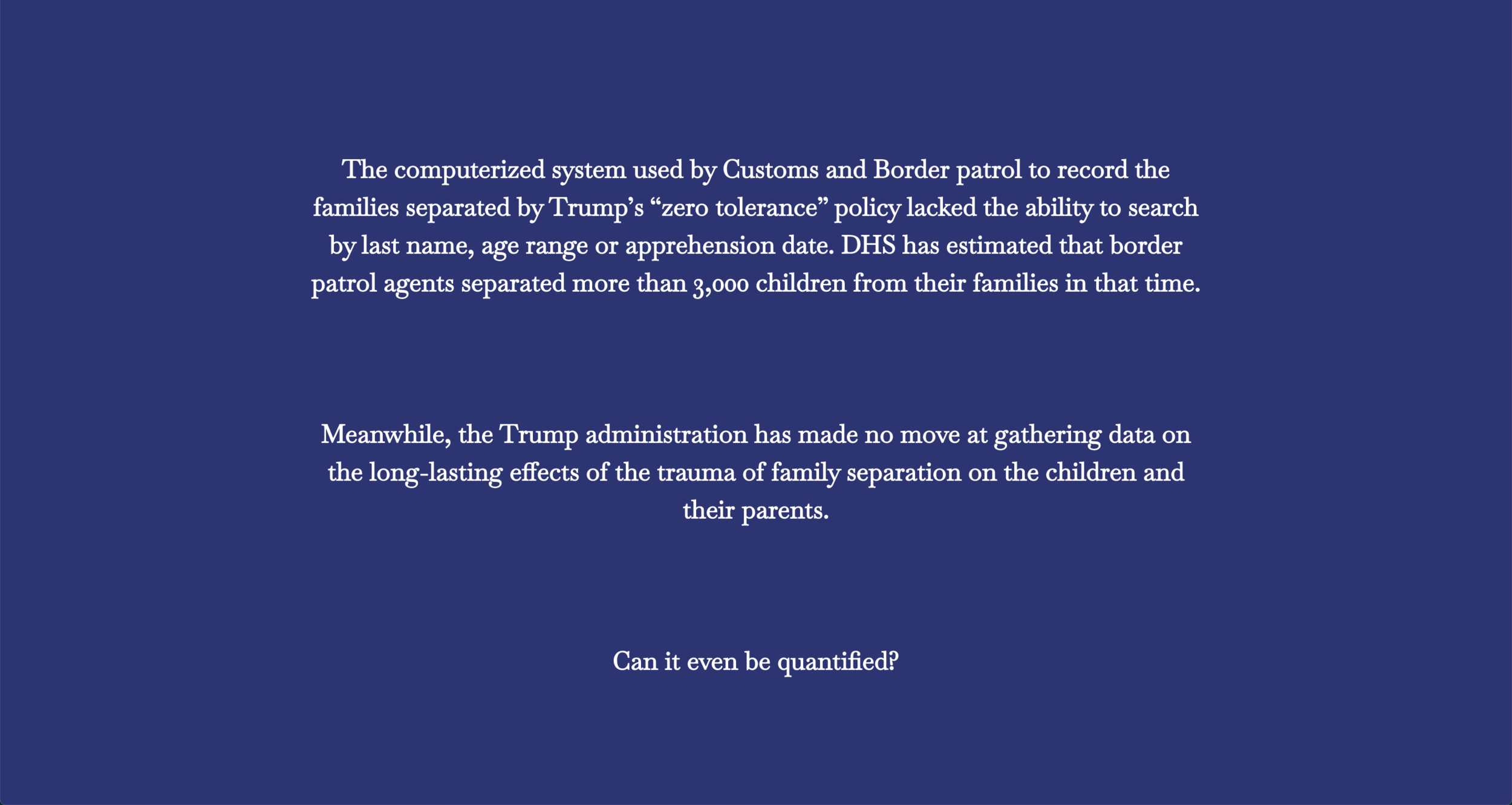
The main goal for the final project was to do a data critique so we decided to focus on displaying visually the way that some data is quantified, and then generate a critique about the fact that some of the data is not being collected in an ethical way and also how the poor IT techniques are affecting the families that are currently being separated in the border.
The process begun by establishing certain charts that we wanted to use in order to display specific data points that we found online, we knew that we wanted to accomplish a “Scrolytelling” look and feel and we wanted to divide the experience between the data that can be quantified and the data that can’t.
In the development process the first step was to create a shared collaborative document in which we could document our research and divide the information between the desired charts.

Content strategy
I the next process I created a sketch file in order to translate the content into a visual representation so that we could try to accomplish the front end following the visual structure that I defined in a static wireframe developed in Sketch.
Static wireframe in sketch
The last phase of the project was to develop the front-end and actually code the website. Since we decided to use d3.js and neither of us was an expert on it, we had to cut back on some of the charts and implement a simplified version but always keeping the concept of dividing the quantifiable from the unquantifiable (which we decided to display as stories or quotes).
The coding process was done between both Cara and I by doing peer programming, we met multiple times and coded together, sometimes one will lead the computer while the other would observe and viceversa, which allowed both of us to understand and learn a lot from the code.
The final result is a scrollytelling data visualization:


Sources:
https://sph.umich.edu/pursuit/2018posts/family-separation-US-border.html
https://www.apa.org/news/apa/2018/border-family-separation
https://www.latimes.com/science/sciencenow/la-sci-sn-separating-children-psychology-20180620-story.html
https://www.newyorker.com/news/q-and-a/how-the-stress-of-separation-and-detention-changes-the-lives-of-children
https://www.pbs.org/wgbh/frontline/article/children-separated-from-their-parents-at-us-mexico-border-showed-increased-signs-of-post-traumatic-stress-us-report-says/
https://www.cbsnews.com/news/faces-of-family-separation-cbsn-originals/