For the first assignment of the semester the intention was to start interacting with data sets and find a way to visually display the information. I decided to work with a .JSON file since it is a data structure that I understand and I felt more comfortable with. For this week I wanted to focus on understanding the data structure and how to navigate throw it. I also spend some time analyzing which p5.js elements I could use in order to create three different visualization of the information.
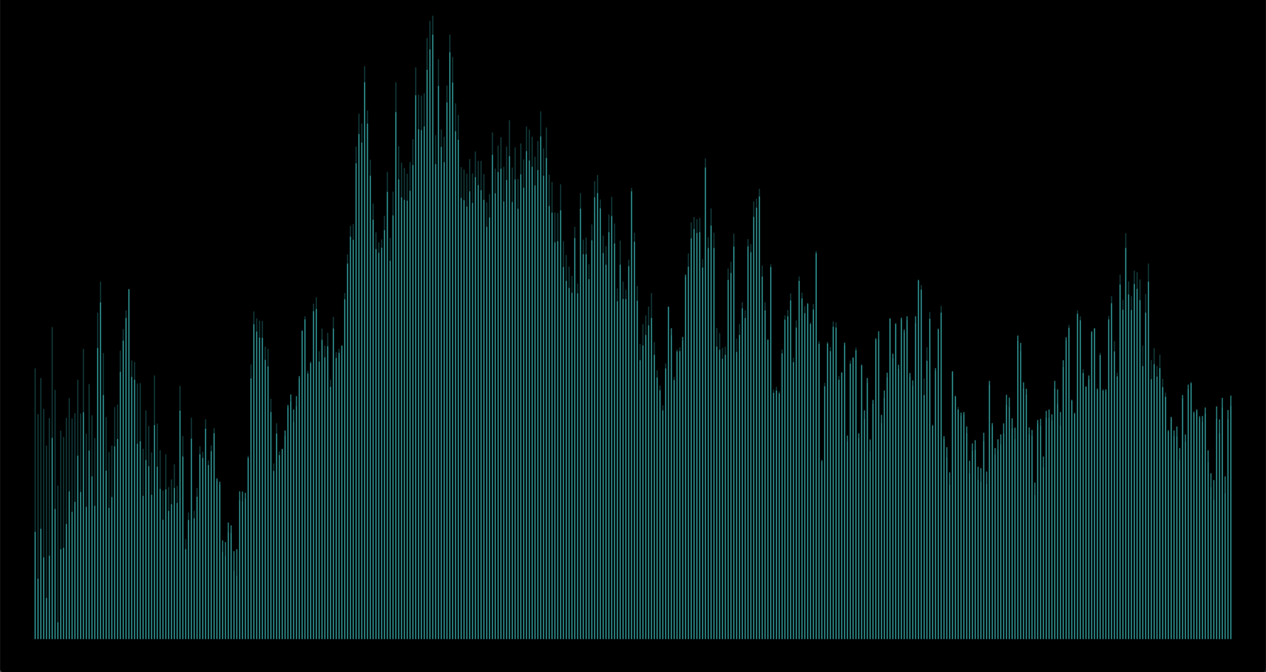
For the first proposal I used the base of data over time with the map functionality to display the years in the x axis and the ring width in the y axis, at the same time I wanted to create a visual comparison between the ring width and the growth index, therefore I displayed them in different colors and joint them with a 1px line.
The use of contrast to differentiate the main data point (ring width) vs the secondary data point (growth index) was achieved by using different colors and sized to the elements. I used rectangles with rounded corners in order to display the information.

Proposal 1: Ring Width vs Growth Index over time.
For the second proposal I decided to continue working with the same distribution of the years and ring width however this time I wanted to try different contrast in the same elements, opacity and shape in order to create visual focus on the primary elements and display in the background the secondary data point as a point of reference. The problem faced with this visualization is that the only data points that can be shown in the secondary layer of information are the years in which the growth index was higher than the ring width, however I believe this exploration worked as a way to understand in which cases opacity and layering information can be useful or in which cases it might hide important information for the viewer.
Proposal 2: Ring Width vs positive Growth Index over time.
In the third proposal I decided to explore the concept of rings, I wanted to show the growth over time in a concentric way. I used the arc element in p5.js in order to achieve that. Once I was able to create an arc for each year (in the x axis) with it’s corresponding ring width (the height of each arc) I decided to use the mapping function in order to change the color and the stroke weight as the years pass. This is definitely a more abstract way of representing the data but it was interesting as a visual exploration of the possibilities with the same dataset.

Proposal 3: Years and Ring Width
Technical details:
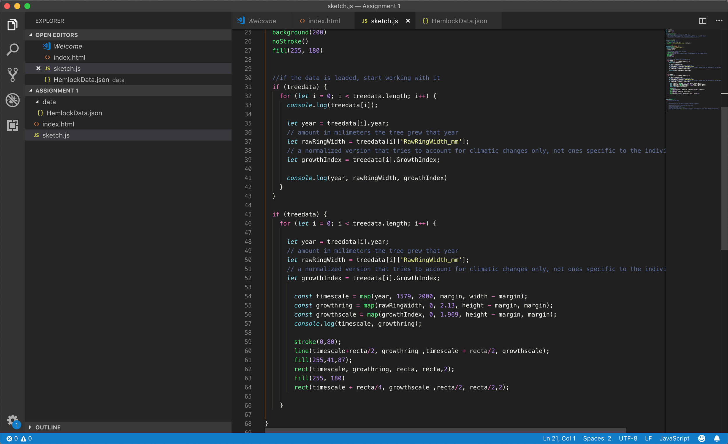
Code for proposal 1

Code for proposal 2
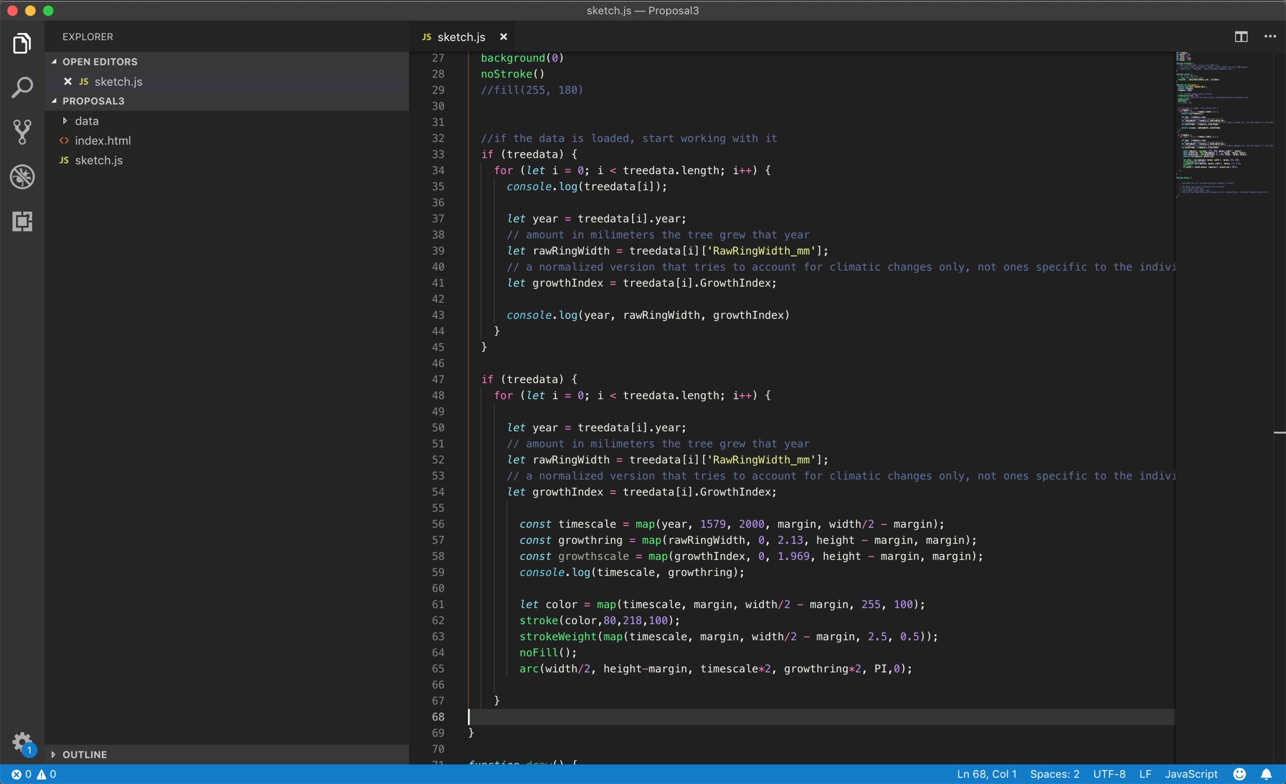
Code for proposal 3