Critical Objects Final Project Proposal

After I presented my project YUZPE: Emergency Contraception for Costa Rica, three days after I read the amazing news that finally, after some time of discussion the government decided to allow the sanitary registration of “the day after pill” in Costa Rica.

I was really happy about it specially since I have beed working on my Critical Objects project related to that topic. I thought that this was the end of my criticism, however, a day after that news were release, the Catholic Church emitted an official position to the news.

Basically the Catholic Church is saying:

“ For the representatives of the Church, the pill is linked to abortion. In addition, they affirmed that they want to accompany these women and their children, show them the greatness of God's love, Lord of life and propose to all people of good will that the solution to the difficulties is not to eliminate the lives of the most defenseless, but to protect basic human rights, starting with the right to life and continuing with the rights to decent work, education, health and safety for women and their children.”

As I mentioned in my previous project, the problem comes from way back, there is no sexual education allowed in the country and children and adolescents don’t have enough resources when it comes to sex-ed which is leading to a big amount of adolescent birth rate. The lower income population is the one that suffer the most from the church and the society position to the issue therefore I would like to work on a Critical Object that speaks directly to this issue.

Topic: Lack of Sexual Education and access to health due to the intervention of the Church and the government in kids and teenager education (subject to change of focus as I do more research).

Group: Since I will continue working with a subject related to Costa Rica I decided to work alone.

Limitations: This is a project for a third world country, therefore there is no universal access to internet and also the population who are more affected by this policies and church intervention are the ones with less income, therefore low income will also be a limitation for my project.

Framework: I would like to stick to the regular design framework that I used for the YUZPE assignment: Research, Concept, Moodboard, Prototype, Testing and Implementation.

YUZPE: Emergency Contraception for Costa Rica

Emergency contraception is something that has been part of women’s lives for a long time in a lot of countries, however in Costa Rica, this is not the reality. My country is very Catholic minded and the politics are mostly dictated by religion, specially when it comes to body politics.

The sexual education is almost non existing, specially in public schools. Teacher are not allowed to talk about sexuality and reproductive health with students and even if they wanted to there is no class or curriculum that allow them to talk about this with their students. The problem goes beyond the classrooms because most of the families are still very close minded which means that children and adolescents (even young adults) don’t have the confidence to talk to their parents about these subjects.

When it comes to contraception methods, the lack of education causes that a lot of young women that are sexually active doesn’t know how to properly prevent a pregnancy, which leads to the fact that in 2016, 14.7 out of 100 new borns were from an adolescent mother (number that was celebrated as the lowest in the history of the country).

Costa Ricans have access to regular contraception pills over the counter, but there is no way to get the emergency contraception pill. No pharmaceutical company has ever register the drug (mostly because the way that the Catholic believes affect the laws and the decision making process in the Congress).

In the 70’s a researcher found a way to have emergency contraception using regular birth control pills: “The Yuzpe regimen is a method of emergency contraception that uses a combination of ethinyl estradiol and levonorgestrel. It is less effective and less commonly used than a larger dose of levonorgestrel alone, a dose of ulipristal acetate, or insertion of a copper intrauterine device”. Because it is possible to buy regular contraception pills over the counter it is possible to do the YUZPE method, however most women doesn’t even know this exist and they have no idea if exist or which kind of pills to buy and how to consume them.

Recently a company tried to finally register the drug, since it is not an abortive pill, the congress has to approve its use, however they are trying to find ways to make it more difficult for women to have access to it, for example, the commercialization of the pill will implicate that a medical prescription will be necessary and also, if it is implemented in the Social Security system, it will be only in cases of rape.

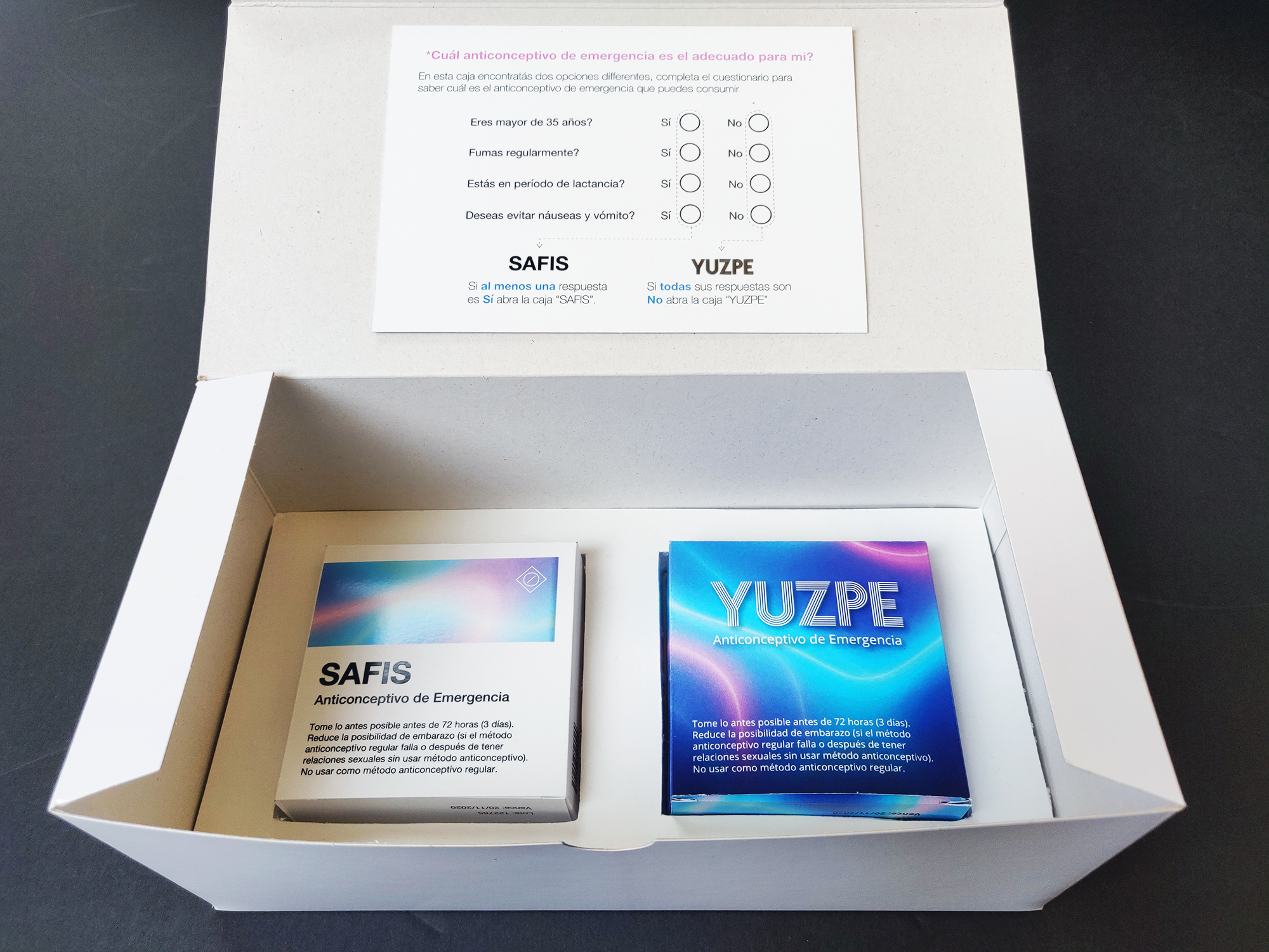
This is the beginning of my Critical Object for body politics. I wanted to create an emergency contraception kit with currently available pills in Costa Rica and an easy guide on how to use it and in which cases it is not possible to use, such as women in lactant periods, women over 35 y/o or women who smoke frequently (this is due the combination of two different hormones, instead of only one like is the case with pills like “Plan B”).

My process started defining the framework to use, starting with the research, mood-board and creating a prototype and finally the Design and Implementation. After I started the research, the sketching of ideas became a very crucial part of my design, I knew that the project was going to heavily rely on layout, graphic design and visual communication therefore I had to make sure that the layout design of the pills blisters was going to be the core of my project.

The next phase was to define a moodboard. I did benchmark research to understand how the packaging design of birth control pills has been done in the past. I also wanted to create a project with a 70’s look and feel to exemplify the fact that the YUZPE method was discovered in the 70’s however there have been a lot of newer findings (one pill that prevent the women from vomiting and allows to be taken by a wider range of the female population), however, in Costa Rica we are still using very old and insecure technique.

Moodboard

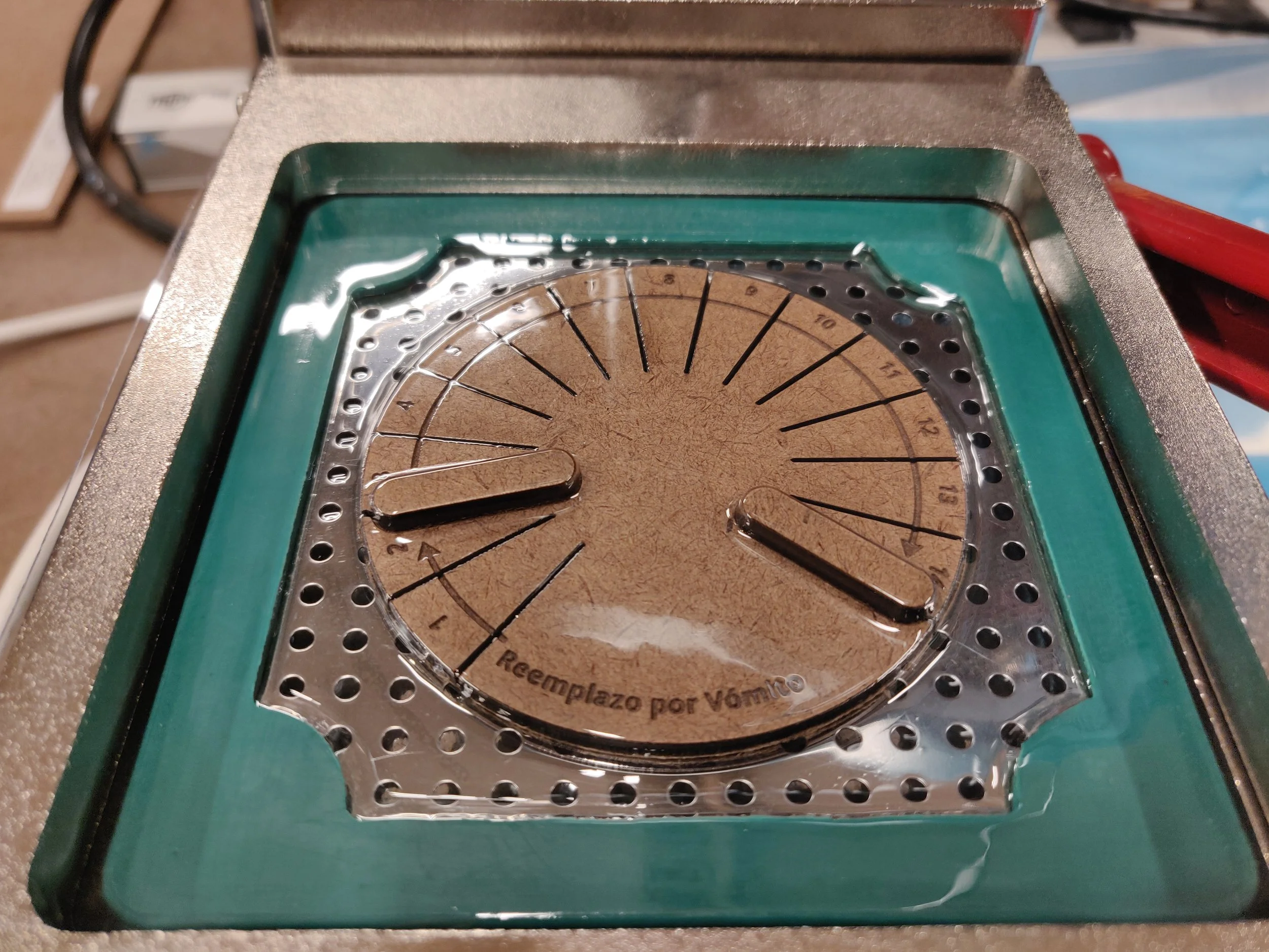
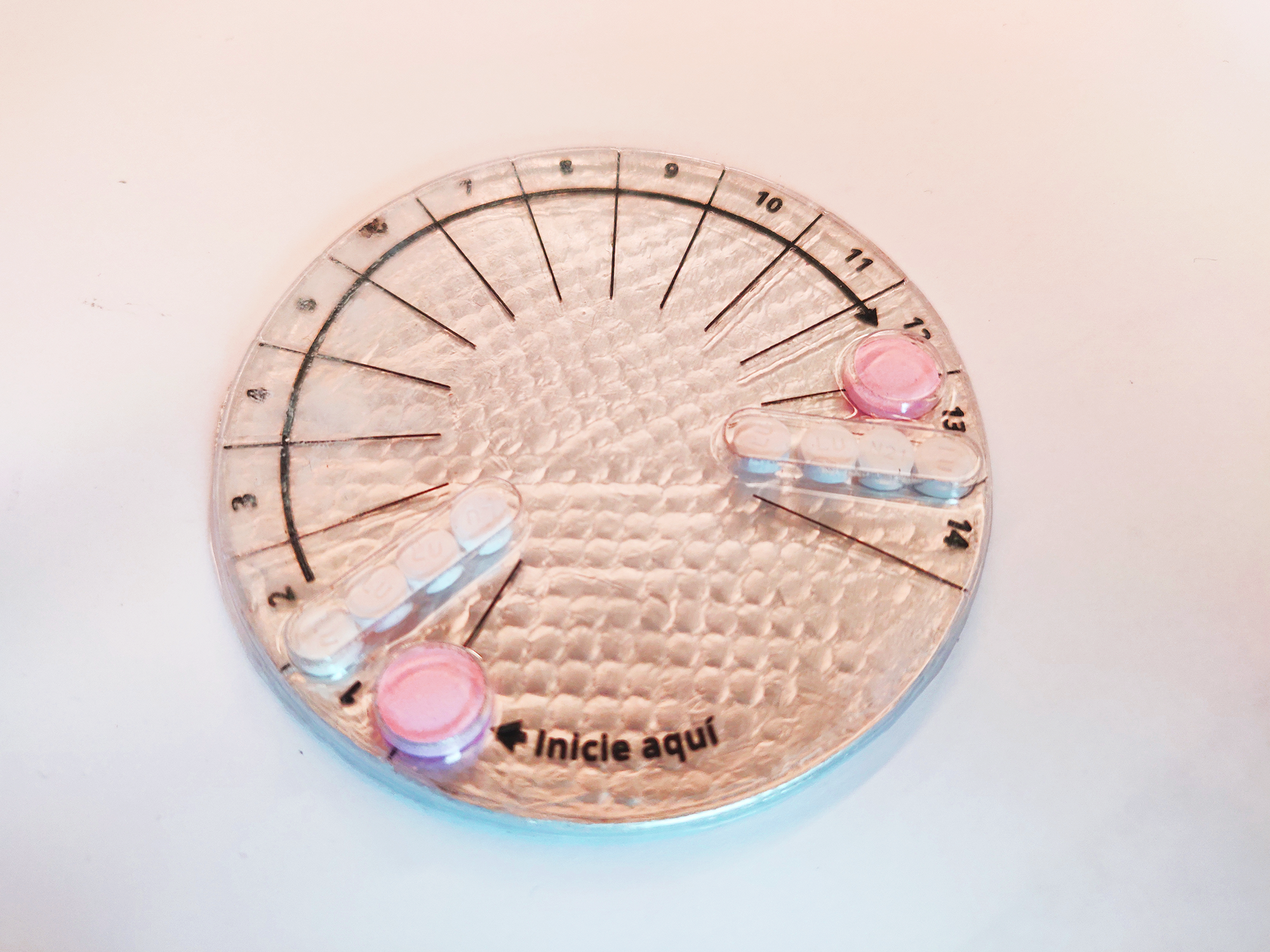
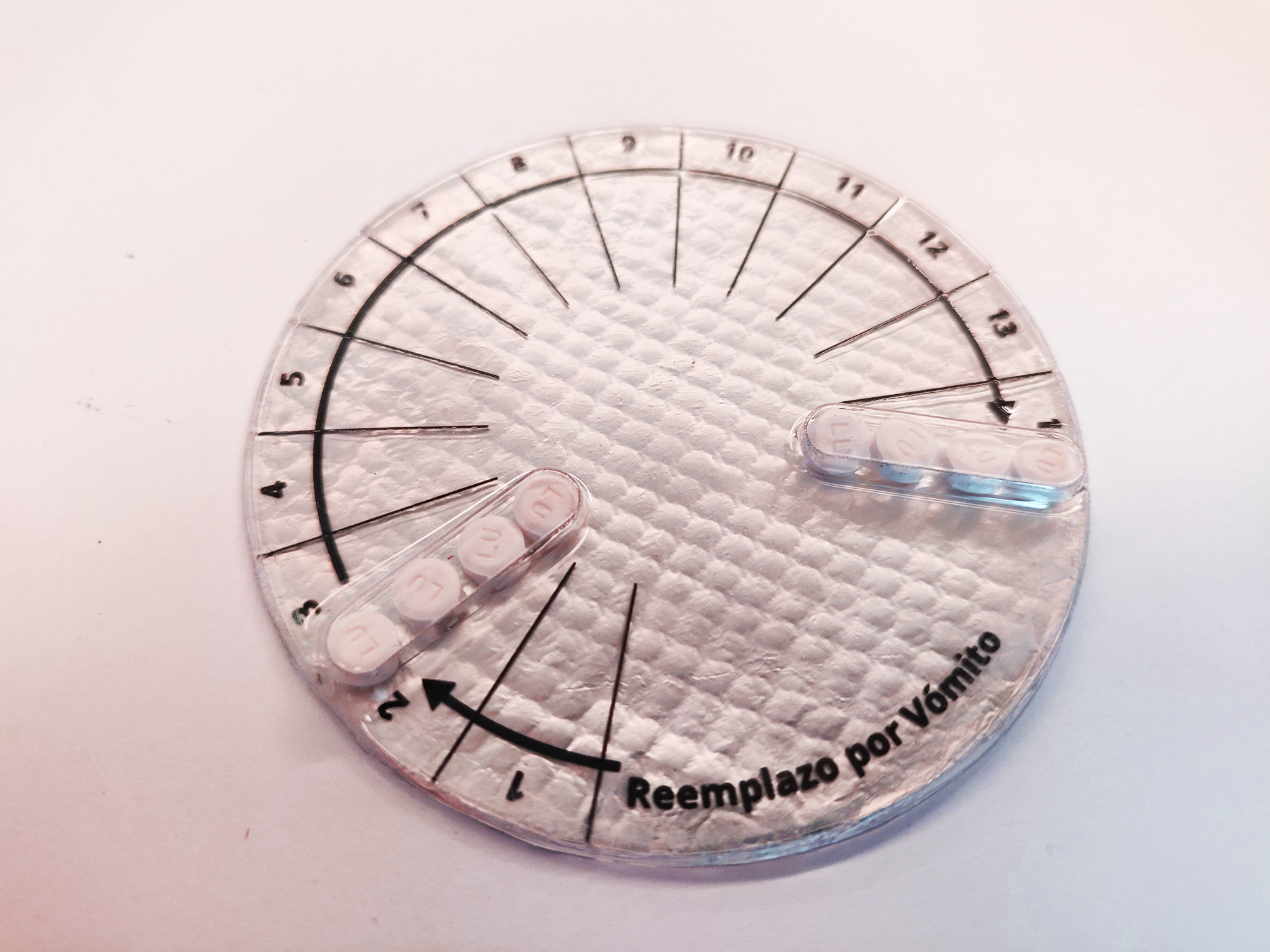
The next phase was the fabrication of the prototype. I started by creating the form in the laser cutter, after I defined the layout in Illustrator, I used the Vacuum Former in order to create the pills blisters (3 different ones) that are going to be placed inside a box. The final prototype consisted on 3 different pills blisters, with white paper to indicate the instructions on how to take the pills. The prototyping process allowed me to test and correct the size of the actual pills and quickly iterate in order to have a better final result.

The three blisters consist on:

  • Blister A: The desired scenario of having only one pill with one hormone that causes less nauseas and it is more effective. This blister is empty because we do not have access to this drug in Costa Rica.

  • Blister B: Contains two pink pills (anti motion sickness pills to prevent the women from throwing up) and eight combined (2 hormones) contraceptive pills.

  • Bister C: Since the combination of hormones is heavy for the system, the women is likely to vomit the pills, if this happens before one hour, she has to take them again.

Blister Description

Blister Description

I also designed an instructive on how to consume the pills. The time that the women needs to wait since they take the first wound until the second one is crucial and this information is normally difficult to find, specially it is difficult to visualize in an easy and intuitive way. The visual design was done paying attention to how to effectively communicate how to take the pills and how much time to wait.

The final design of the box and the blisters is a concept of a 70’s themed box that contains all the pills and the necessary information to “legally” practice an emergency contraception in Costa Rica using the YUZPE method.

Final Project | Critical Objects

For the final project I decided to continue working on the same line of the YUZPE pill, I noticed that the criticality of the empty pill was missing and I wanted to improve the design components that lead me to communicate the message in a better way. There were also aspects about the fabrication in the first iteration that I wanted to correct therefore I decided to continue the project.

After I presented my project YUZPE: Emergency Contraception for Costa Rica, three days after I read the amazing news that finally, after some time of discussion the government decided to allow the sanitary registration of “the day after pill” in Costa Rica.

I was really happy about it specially since I have beed working on my Critical Objects project related to that topic. I thought that this was the end of my criticism, however, a day after that news were release, the Catholic Church emitted an official position to the news.

Basically the Catholic Church is saying:

“ For the representatives of the Church, the pill is linked to abortion. In addition, they affirmed that they want to accompany these women and their children, show them the greatness of God's love, Lord of life and propose to all people of good will that the solution to the difficulties is not to eliminate the lives of the most defenseless, but to protect basic human rights, starting with the right to life and continuing with the rights to decent work, education, health and safety for women and their children.”

The group was asked to choose two limitations and a framework:

Limitations: This is a project for a third world country, therefore there is no universal access to internet and also the population who are more affected by this policies and church intervention are the ones with less income, therefore low income will also be a limitation for my project.

Framework: I would like to stick to the regular design framework that I used for the YUZPE assignment: Research, Concept, Moodboard, Prototype, Testing and Implementation.

Emergency Contraception pills
top view
3.png

Midterm: Pollution Inequality Factory

For the midterm assignment I worked with Stefan A Skripak, the first stage of our procvess was to sit together and discuss about a subject that was important for both of us, he have worked together in the past and we already knew that we care about some common issues therefore we started by discussing them. He both care about environmental and also racial problems and Stefan found a Scientific Paper that talks about the inequality of the pollution created vs the pollution received by different racial groups.

In summary the paper indicates that in the US, the white population creates more pollution (by consuming more products and services) than the Black and Latino population, however they receive less pollution (
based on the places where they normally live). At the same time the relationship is in-equal because the Black and Latino population create less population but they receive more.

For the assignment we decided to work with the following constrains:

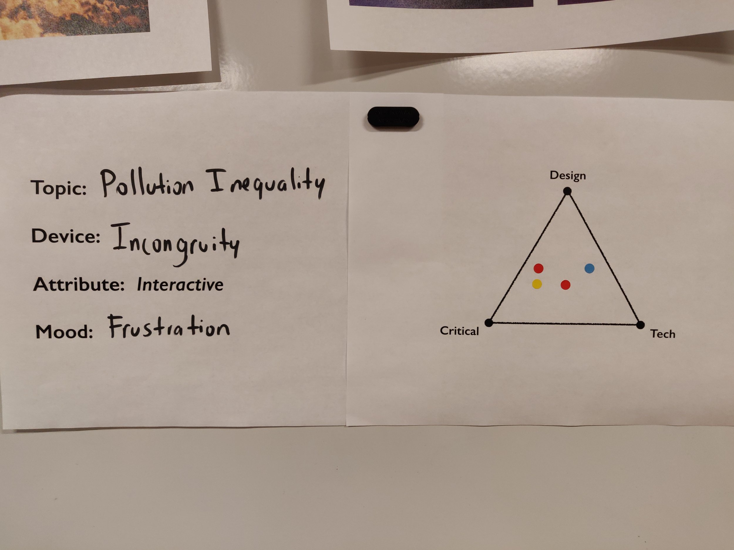
Device: Incongruity

Attribute: Interactive

Mood: Frustration

We focus specially in the mood frustration because we wanted to be able to display the data by creating an interactive physical data visualization of the percentages extracted from the scientific paper and the frustration we wanted to be able to communicate by creating an unfair or inverse relationship between the action (consumption/creation of pollution) and the result (being affected by the pollution). In essence we knew we wanted to be able to communicate that even though the white population created more, they received less pollution, and make the users feel frustration by this in-equal distribution.

We considered gamification for being able to communicate the frustration in an easier way however we decided not to go for this approach because the intention will never be to encourage the users to create pollution, even if it is in a metaphoric way. We tried different ideas on how to be able to visually represent this unfairness, one of them was to play with gravity and visual illusions but the problem with this approach was the design component of it and how to be able to use metaphors for the consumption and the pollution.

We decided to work with the component of “Air Pollution” and “Plastic consumption” by using inflatable plastic bags based on the fact that we see a lot of plastic bags hanging from trees in NYC and this is something that frustrates us, therefore we wanted to use it in our favor.

Plastic bags on trees
plastic-in-trees.jpg

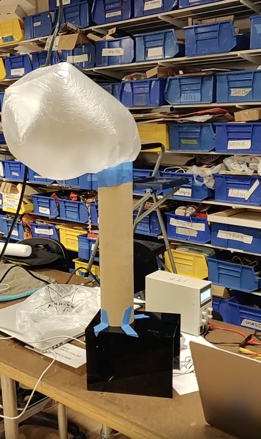
The next phase of the project was to prepare a quick prototype and materials for the feedback session that we had in the last class, the main goal for us was to test if we were being able to communicate the message correctly and we also wanted to receive feedback on what was the best was to inflate the plastics bags by using the user interaction with the piece and at the same time how to be able to use that interaction in order to imitate the human consumption.

Feedback Session subject and inspiration

Feedback Session subject and inspiration

The first proposal that we took to the class was to activate the fans by pushing buttons with three different timers, we envisioned this being used by 3 users at a time however we didn’t want to gamify the experience, therefore we also sketched some silicone pumps (one bigger than the others to communicate the fact that the white population consume more).

Sketches first proposal

Sketches first proposal

By sharing our Device, Attribute and Mood with the class and explaining our research and our ideas we were able to gather really good feedback and at the same time the location of the dots among the triangle gave us an idea that we were heading in the right direction because most of them were located to the center. We also figured out that the interaction with either the buttons or the silicone pumps was not intuitive and clear enough so we went ahead and continued the brainstorming. Another element that was still not solved was the form factor so we did some more research and sketches to define how we wanted the box and the containers to took like.

Parameters and triangle voting activity

Parameters and triangle voting activity

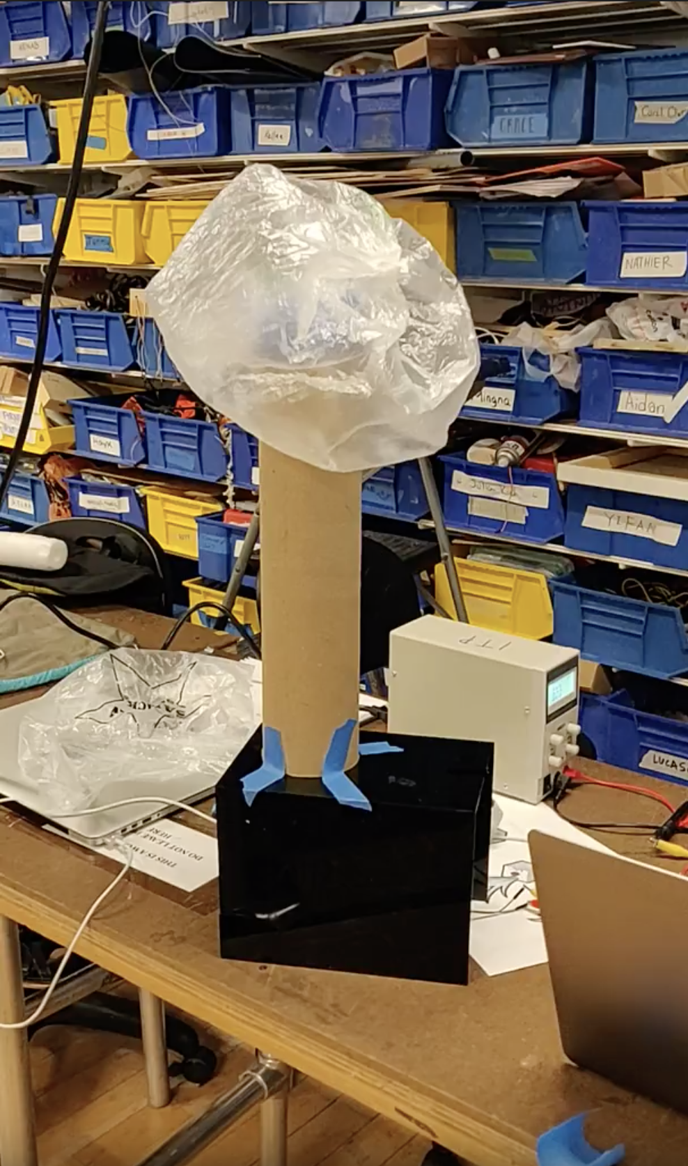
For the feedback session we also created a “works like” prototype to be able to test if the idea of inflating plastic bags with computer fans was going to work. We decided that this was a viable solution for our plan therefore we continued working with this functionality in mind.

works like prototype

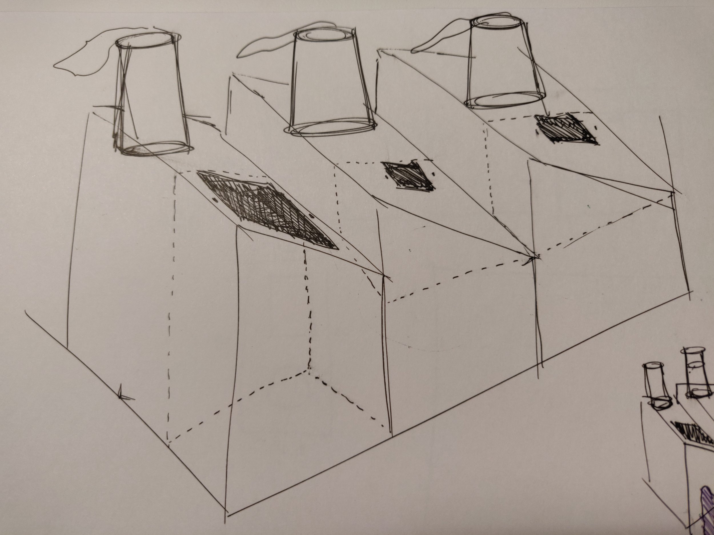
For the second round of sketches we decided to work with a “factory” look and feel, in order to generate a shape that will use a metaphor as part of our communication system. We also reimagined the user interaction by creating 3 “trash cans” that each of them would have the size of the hole different according to the data extracted from the scientific paper. We also thought about limiting the amount of trash that each container could receive in order to be able to display the data in a more interactive way.

The way that we envisioned this working is by using IR sensors in order to detect when the user throws trash in a specific container, and sending that signal to be able to activate the computer fans in the bottom of the pipes.

sketch round 2
sketch round 2

For the fabrication we used mezonite for various reasons, the material cuts very good in the laser cutter, technology that we wanted to use in order to be able to fabricate the shapes in a more precise way, we also wanted top work with materials that are not (as) bad for the environment therefore we knew we wanted to avoid acrylic. The design process of the pieces for the containers took a lot of trial and error as well as tolerance considerations in order to be able to fit all the pieces together.

We used PVC pipes and painted them with two layers of black spray and after that we applied a metallic spray in order to imitate some factory pipes. The plastic bags process was long and it also took a lot of testing, we tried at least 5 different kind of plastic bags and decided to use compostable bags, we needed something thin that would allow us to inflate the bags quickly but at the same time to make it obvious when the bag was not inflation (when the fan is off).

It was necessary to cut and re-seal the bags in order to remove the logotypes in them and also to make them look like clouds or flumes. I used the heat gun in order to reseal them and also change the shape a little bit and make them less uniform.

Fabrication+process
Fabrication process

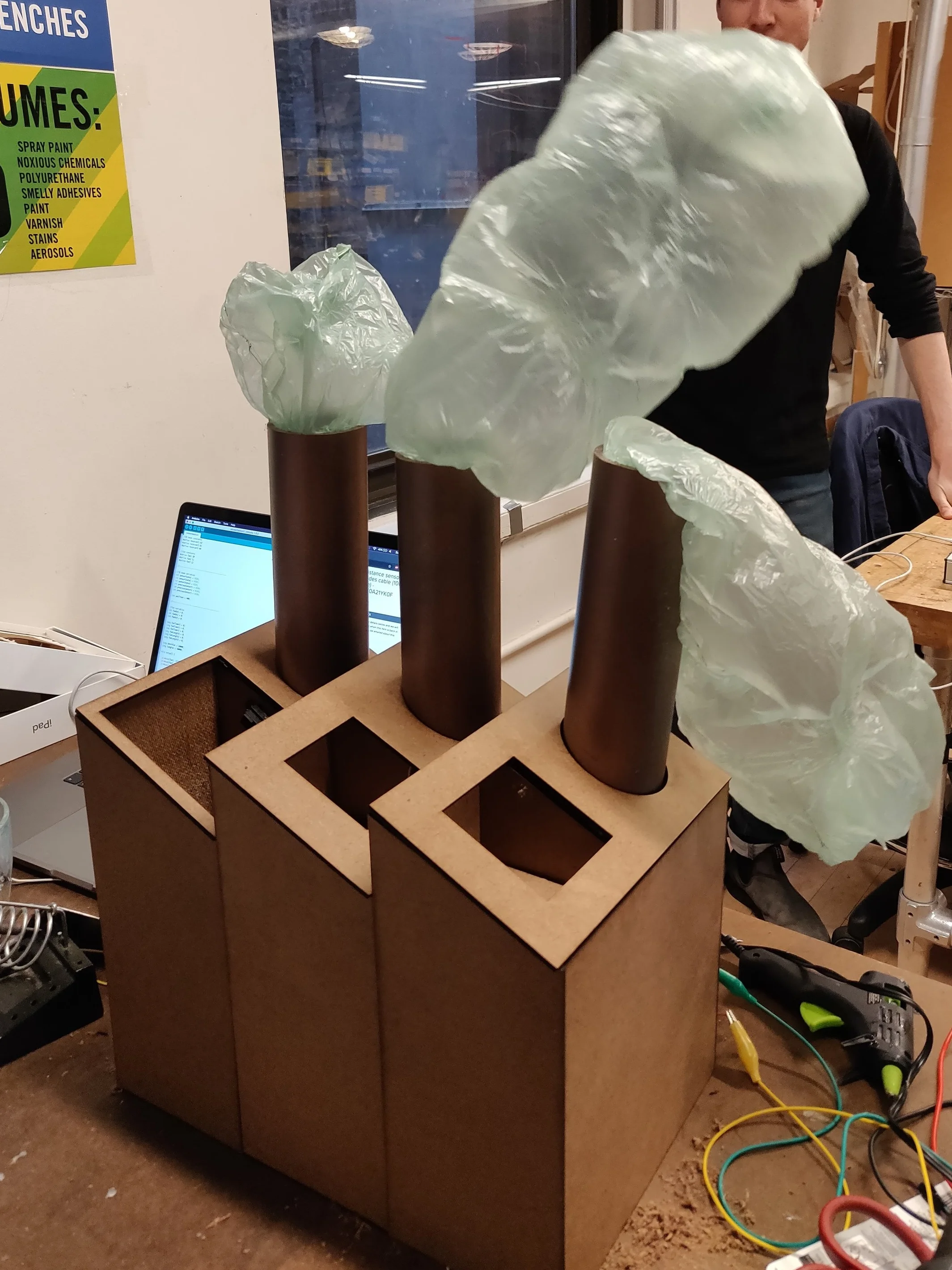
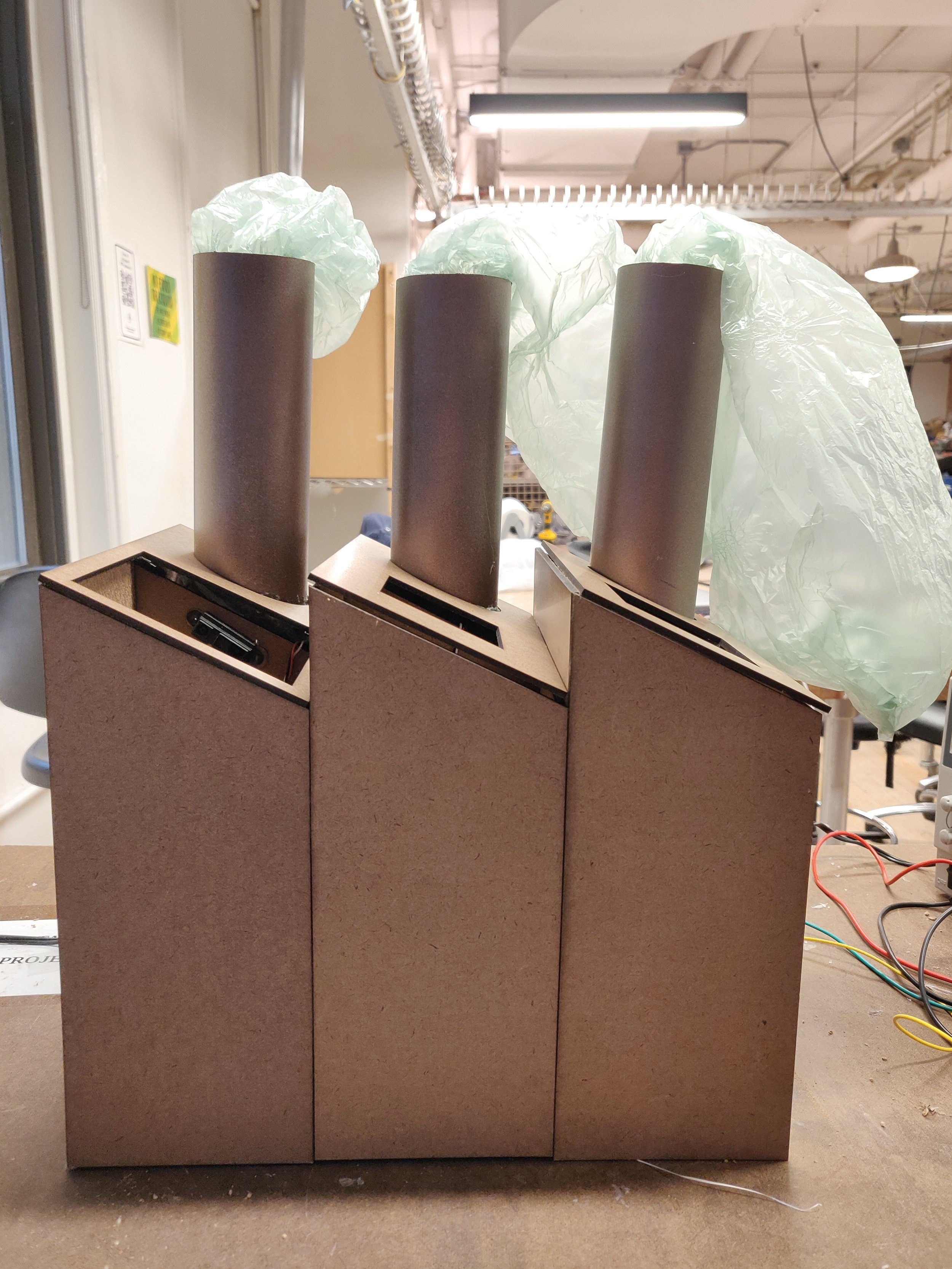
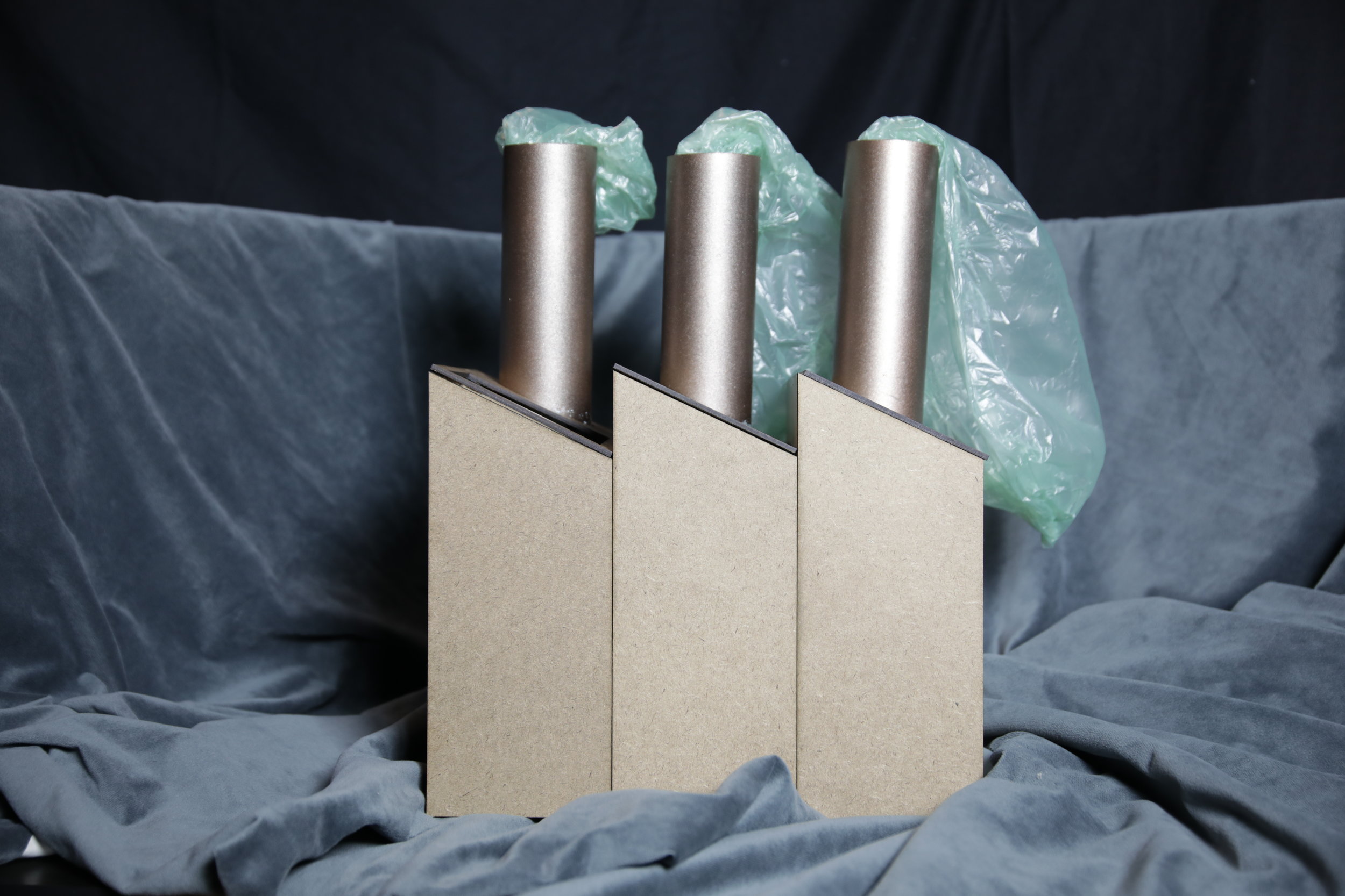
The final result is a structure constituted by three containers, each of which has a hole for the user to put trash on it, the three holes have different sizes, according to the amount of pollution produced due to consumption of products and services (numbers extracted from the scientific paper). The first container to the left represent the white population, therefore the hole is bibber, the bottom if the container is the floor (therefore there is more room to put trash, and the size of the bag that inflates is smaller, representing the fact that they produce more but receive less pollution. The other two containers to the right are the hispanic and Black population, which holes are smaller and also the containers have a limited amount of trash that can be put in, and also their plastic bags are bigger, representing the fact that those populations produce less but receive more pollution.

Final Result
1D6A9972.JPG
1D6A9999.JPG
1D6A9984.JPG

Critical Objects Week 5: The Compraventa Jersey

Team:

  • Cara Neel

  • Veronica Alfaro

Prompts: Wearable device using amplification to produce excitement.

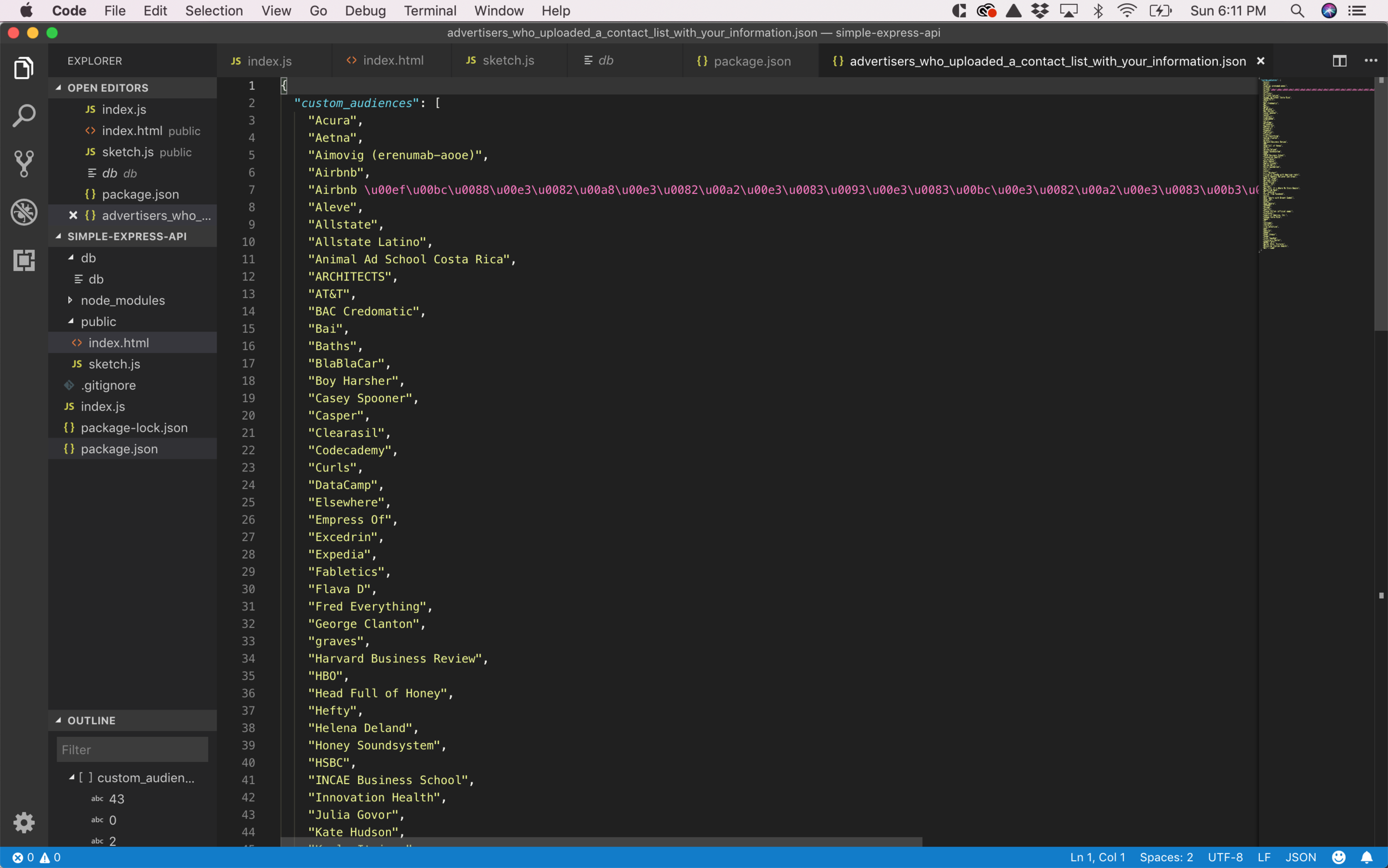
For third third assignment we were constraint to three different cards that defined our prompt and also we were asked to Create a Critical Object to start the conversation about a technology related subject. We decided to work with a dataset that I downloaded from my Facebook’s personal data request that I have done a month ago. The JSON file is called Advertisers who uploaded a contact list with your information and contained more than 80 brands/artists who have used my data to (probably) profit from it.

Understanding the data was very interesting because the list contained artists and brands that I have never hear about before, for example I visited “Elsewhere” a bar in Bushwick at the beginning of last semester, and as part of the elements in the JSON file there were a lot of Electronic music Artists that I have never heard before, who have performed in Elsewhere, so this made me question the way that this information is acquired and spread.

JSON File from Facebook

JSON File from Facebook

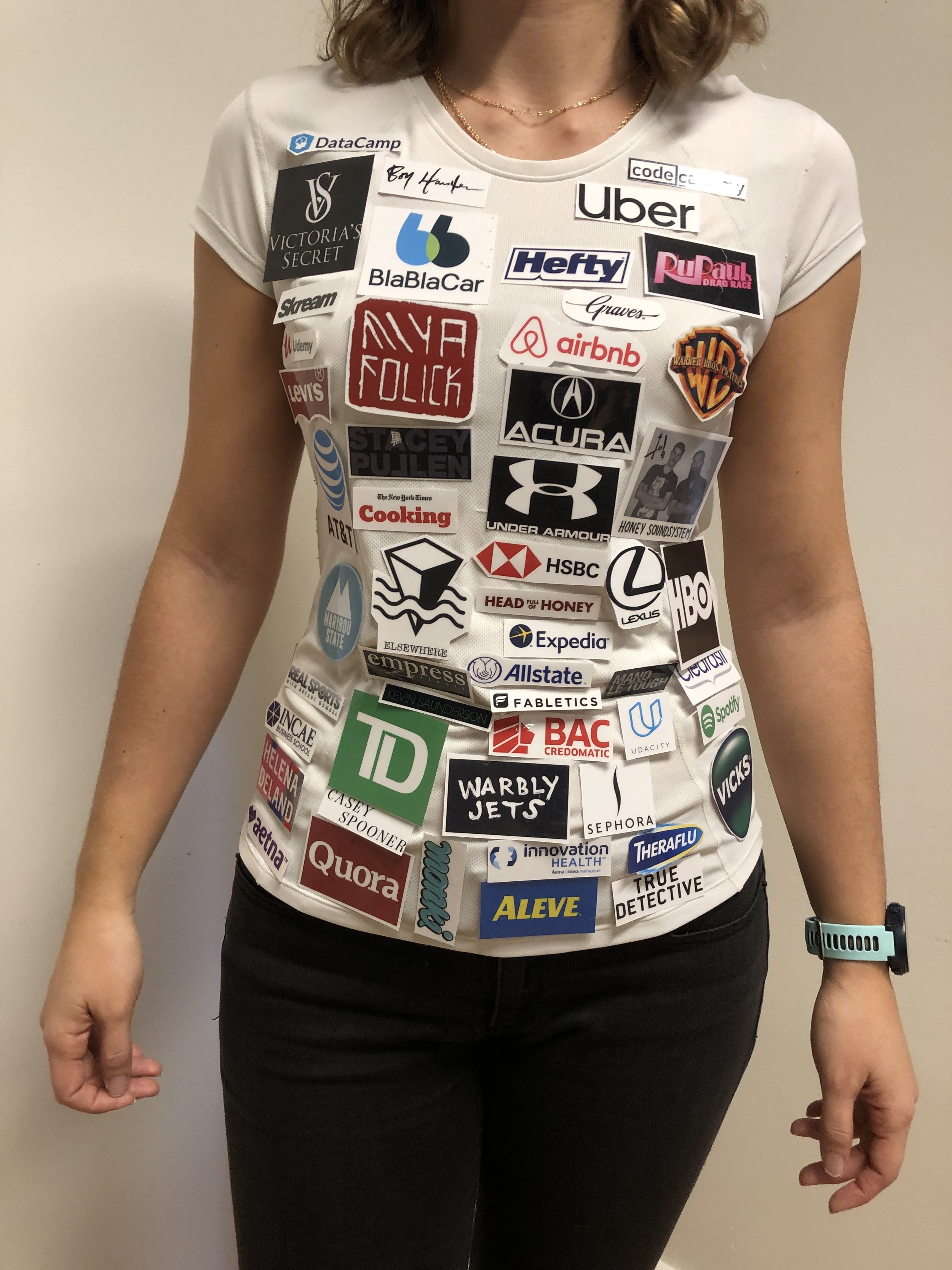
As part of our design concept we decided to use those data points as logos, since those brands somehow managed to use my personal information to make a profit out of it, we wanted to create a Critical Object that would expose those brands and the user would use their body as a mean of communication and display of those brands, and give them “free advertisement”. We used a (very Latin American) design concept. In my hometown (Grecia, Costa Rica) the soccer team is very small and the don’t have funding from the government, therefore they need to use a lot of brands in their uniforms in order to support themselves, they use their uniforms and their bodies as a way of advertisement and promote the brands with their consent, therefore we wanted to use this design concept for our Critical Object.

Design Concept, Grecia Soccer team, Costa Rica.

Design Concept, Grecia Soccer team, Costa Rica.

We started by collecting every logo from the JSON file list, some of them were easier to find, however some of them were more difficult, specially the ones corresponding to the artists who have performed in Elsewhere, these data entries were particularly of more interest for me because I know that I have never interacted with those brands/ artists before so I made sure I was able to collect and visualize all the brands in the list. The original idea was to print the logos in Transfer paper and be able to iron them into a T-shirt, it was not possible to achieve this aesthetic due to lack of that technology in NYC (it took us some time to research about places who would do the transfer of more than 80 logos in a short period of time) therefore we decided to print the logos and laminate them, then put them into a sports Jersey to display our concept.

Searching logos

Searching logos

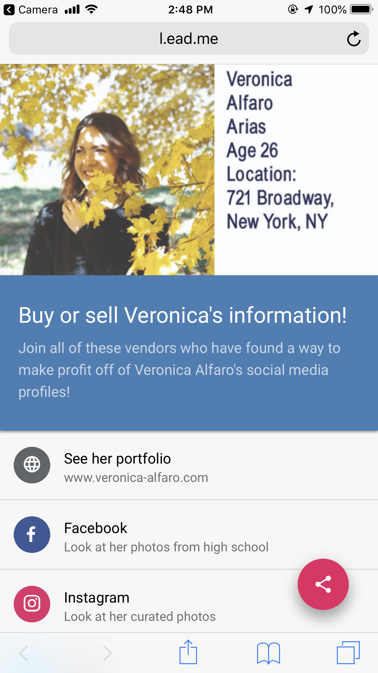
The last part of our concept was to create a QR code that the user can scan from the Jersey and it would display information about myself and social media links that people could access. We used some kind of sarcastic speech in order to start the conversation about the critique that we intended to make.

“Buy or sell Veronica’s information” Join all this vendors who have found a way to make a profit off of Veronica’s social media profiles!

We also incorporated some descriptions for each social media link, for example Facebook would say: Look at her photos from high school, Instagram would say: Look at her curated photos, and LinkedIn would say: Let’s get that employment history!

QR code scan

QR code scan

Social media links with descriptions

Social media links with descriptions

The final design is “The Compraventa Jersey”, we decided to use a word in spanish “Compraventa” that means buy or sell, that matched our visual inspiration from Latin America and also communicated the end goal of the Object. The Jersey is a way to communicate and critique the fact that we as Facebook users agree on their Terms and Conditions, probably without knowing that all of this Vendors are making a profit out of our choice to join Facebook, and at the same time, we somehow know that this is a “free service” that is being supported by advertisement, therefore it is our choice to willingly provide our information and expose ourselves. The Critical Object uses amplification in the fact that we are augmenting the brand exposure in our bodies and it generates excitement when the user scan the QR code and is able to access all my personal information.

Front Design
Back Design
IMG_0574.JPG
IMG_0565.JPG

The video shows how the user will scan the QR code and retrieve my personal information with their phones.

Disobedient Electronics: Breather 129

For this week’s assignment we were asked to create a Disobedient Electronic. We started the process by deciding on a subject to treat. After doing some research we decided to work with data related to mental health awareness, the original idea was to use the ESP23 wifi capability to pull data from an online source. We started browsing from some statistics and we found the amount of deaths by suicide in the US which was very alarming for us.

According to the American Foundation for suicide prevention, on average, there are 129 suicides per day. In order to be able to work with this data we started treating it as suicides per day, and then we converted that number in the time that statistically passes between two deaths by suicide.

Read More

Critical Object: Anti Vax is Whack

For the first class assignment we had to develop a Critical Object. We decided to start the ideation process with an open brainstorm in which each member of the team (3) would choose 5 topics that she cared about and would write it in a post it and paste it on the wall.

Once the three of us wrote the post its we took some time to re group them into areas of interest, one of the most prominent topics was related to health (physical and mental) according to the interests of the group. We wanted to make sure that we were all working in a topic that passionate us so that we could have a better result.

Brainstorming and ideation

Brainstorming and ideation

After a long group talk we decided to focus on the reappearance of illnesses (such as Polio) due to the lack of vaccination given to kids. At that point we were aware that the topic could change while we developed the ideas, however we would like to try to stick to a similar approach.

The next phase was ideation and sketching, we sticked to the post it format since it showed good results in the first phase of the project. We allowed ourselves to freely come up with ideas about how to frame the problem that we stated in the same place.

Sketching and ideation

Sketching and ideation

After the first round of the ideation process and having thought about experimenting with fluids and mechanical structures, we decided that we wanted to work on a Dunk Tank to represent the amount of kids that are not being vaccinated and how that growing number of unprotected population will have an effect on vulnerable people with different conditions and weak immune system .

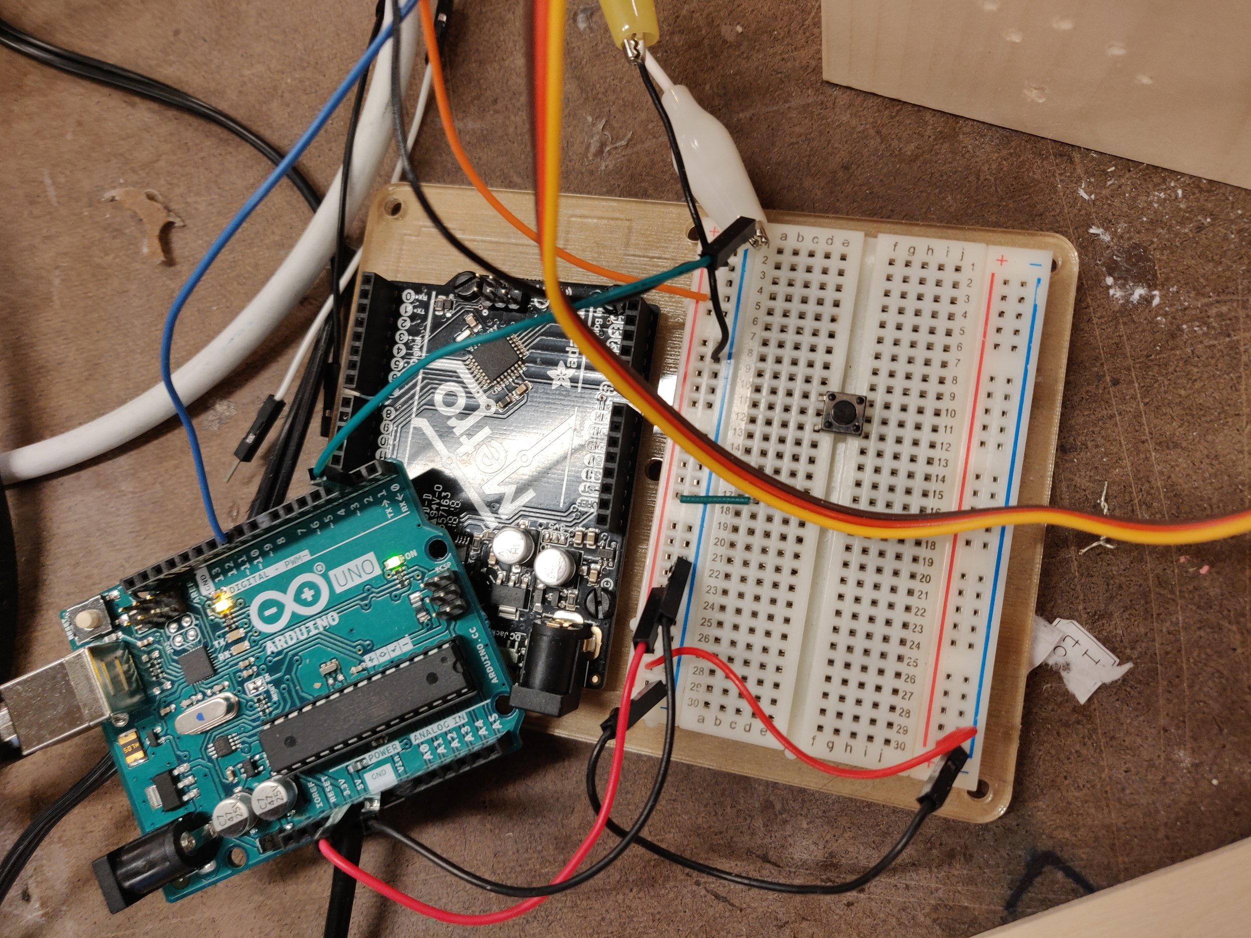
The last phase of the ideation process consisted on determining how to create a dunk tank with the use of an Arduino, a servomotor and some structural materials.

Mechanism and materials

Mechanism and materials

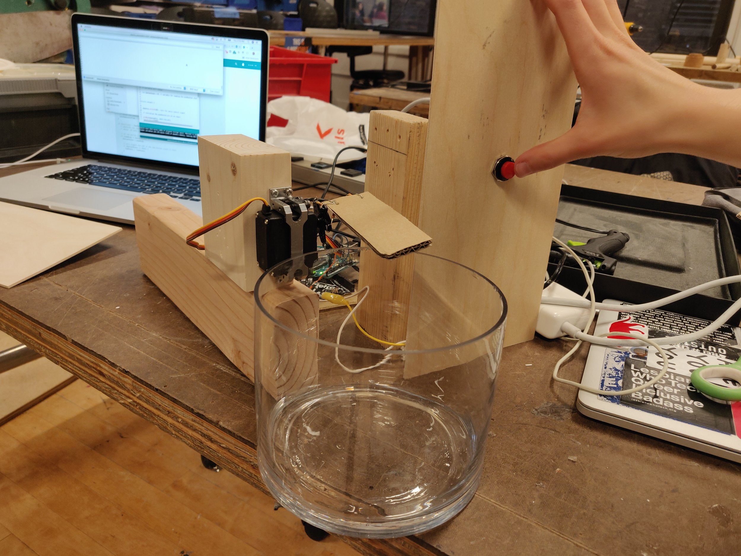
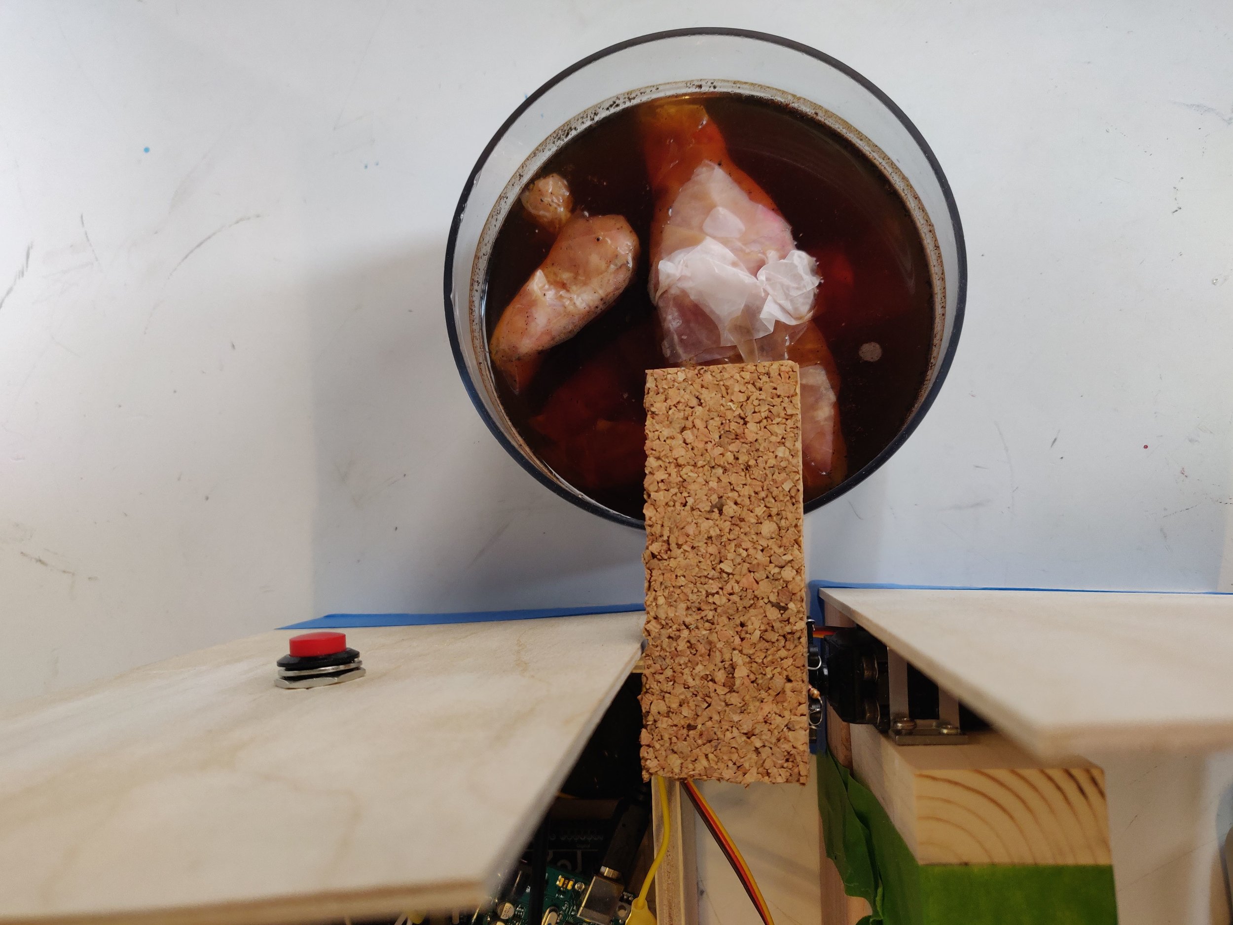
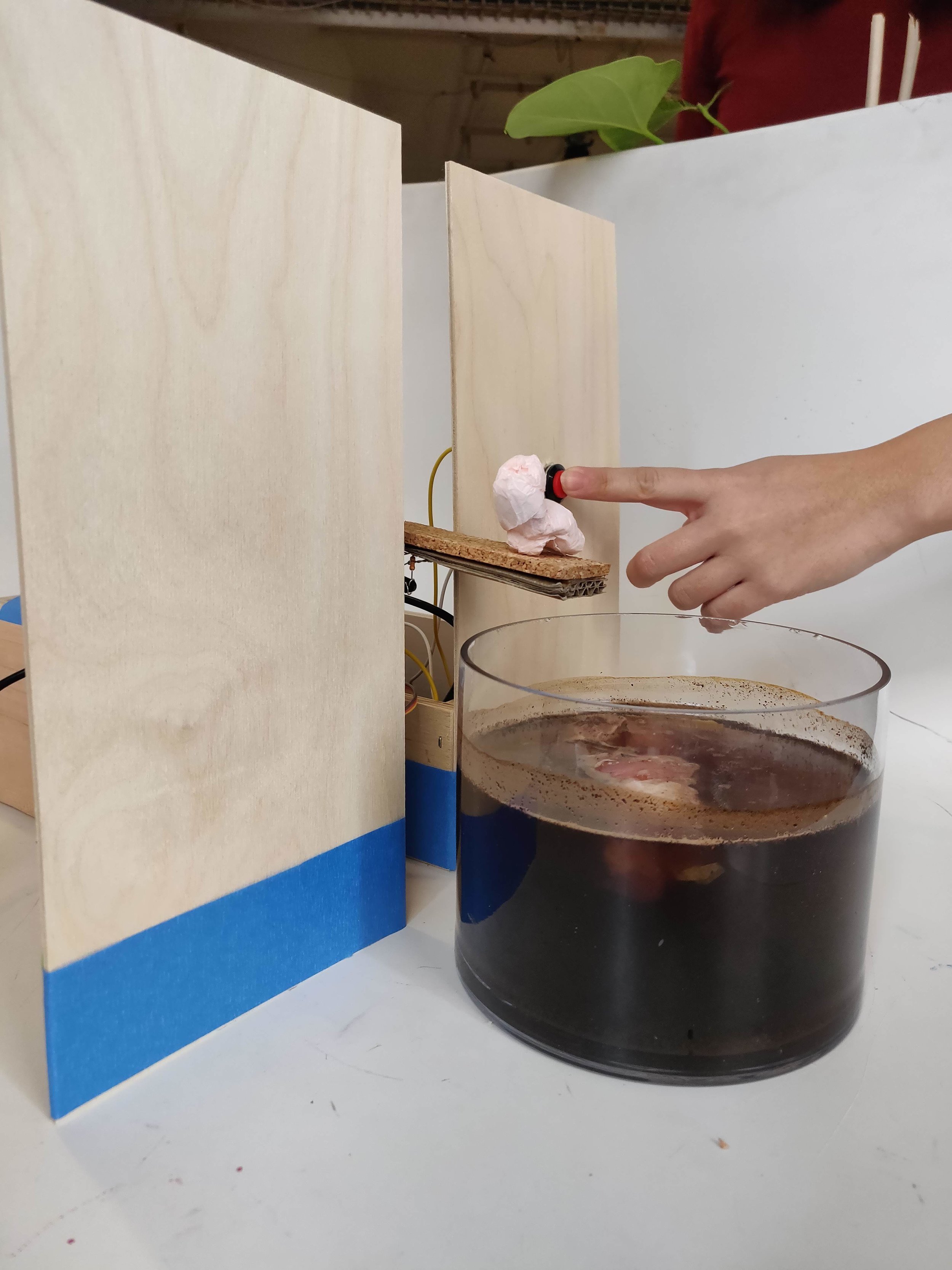
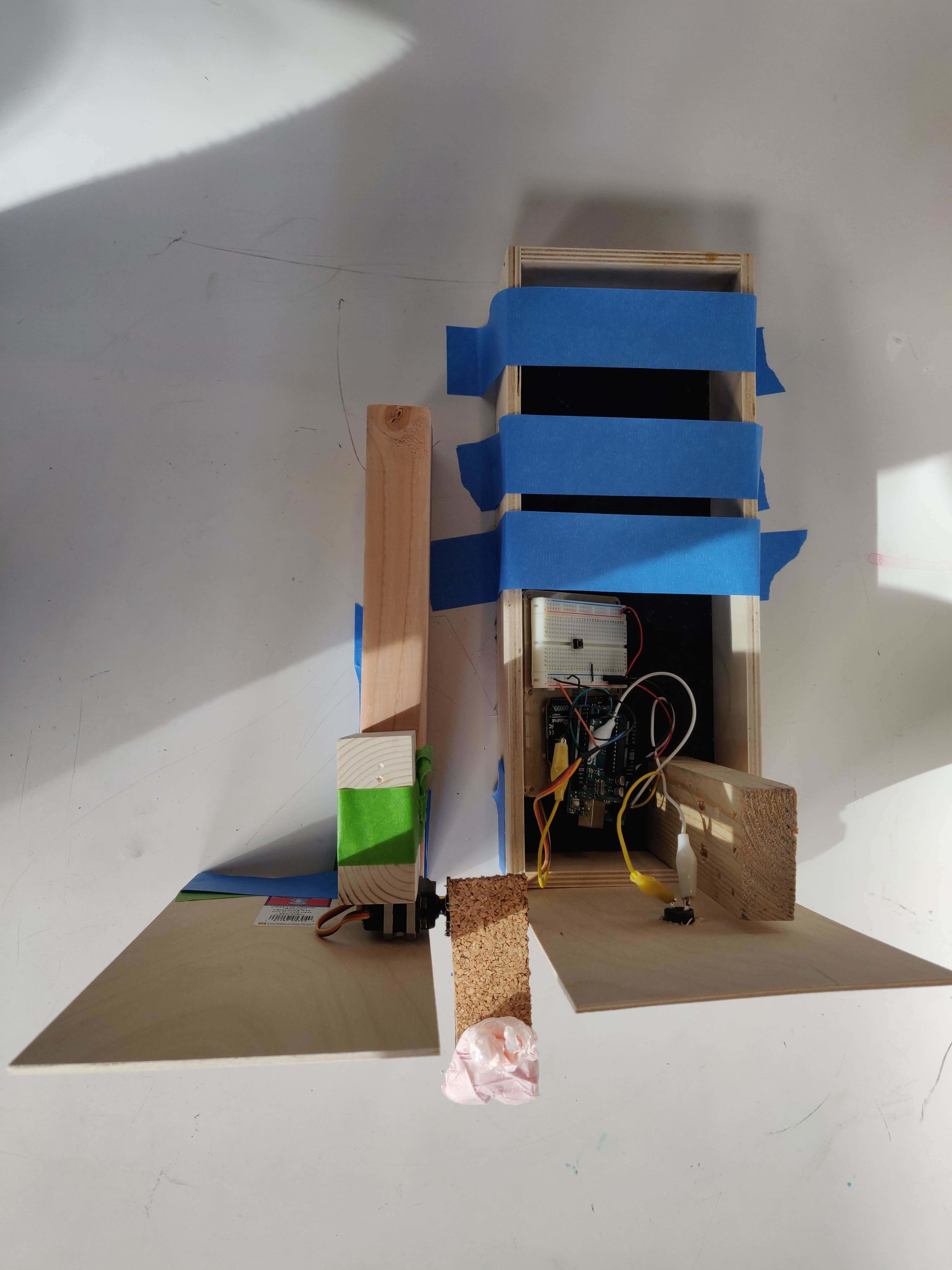
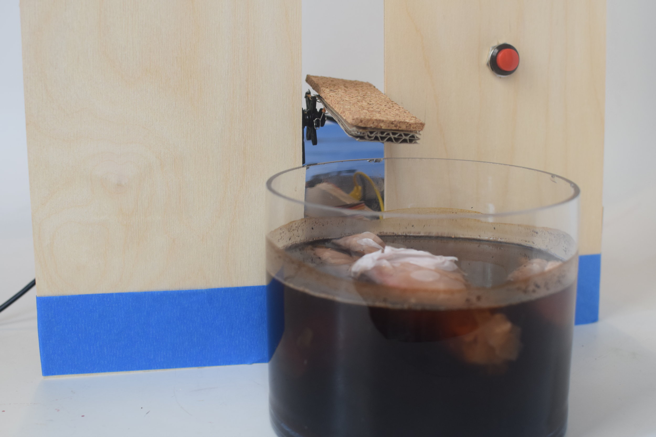
Once we defined the functionalities and the way the object was going to interact with the user we started the production process. The following is the description of the object: Dunk Tank that has a button that triggers a servomotor, every time a user press a button it would add +1 to the counter until it reaches three pushes then that is when the servo will rotate 80 degrees to drop the figure that is going to be on the seat.

We decided to work with balsa wood and some scrap pine wood for the structure, the figure was created with paper and the choice to make it more abstract was based on the fact that we wanted it to be identified as a human figure, however not as an specific person, but more as a group of the population that is vulnerable and will be affected by the decisions of parents who decide not to vaccinate their kids.

Prototyping and coding the functionalities

Prototyping and coding the functionalities

Arduino wiring for prototyping

Arduino wiring for prototyping

With the solved functionality we decided to document the project at ITP and recruit some users to help us push the button so that we could communicate effectively the idea and the meaning of our Critical Object. During the design process it was interesting to notice that we depended a lot on a video with audio or text in order to explain what our project is about, however we believe that for future assignments we would like to explore the possibility of creating an object that will speak by itself and it will not depend on an explanation.
Final Setup

Final Setup

Dunk Tank

The user interaction consist in pushing a button once, the figure in the seat will only fall until a number of user have already pushed the button. We decided to create three different figures with variable sizes and proportions to represent different groups of the population in risk, such as kids and older adults.
The final result is a visual representation of the consequences of affecting the Herd Immunity protection that the most vulnerable sections of the population suffers when parents decide not to vaccinate their children.
Herd immunity is what happens when a community has a high immunization rate, usually 90% or more, which effectively prevents the spread of a disease. Herd immunity protects those who are the most vulnerable, like  children who are too young to be vaccinated and people with compromised immune systems who cannot receive vaccines, like people who have received chemotherapy.

Every drop in herd immunity--even a small one--puts the community and especially the most vulnerable members at risk for contracting the disease. This can lead to serious illness and death for these individuals.

Every choice not to vaccinate a healthy child contributes to a drop in herd immunity. 

This project was developed as a project for the Critical Objects class in collaboration with Cara Neel and Alizarin Waissberg.