For this assignment I choose “City Bike”, a piece of interactive technology used in public by multiple people. The systems consists on two different platforms: 1) physical kiosk in each bike station, 2) mobile app. For the assignment purposes I will focus on the kiosk and the interaction of the users with the bike stations. I did my research on the Washington Pi & Broadway station, which I figured is not a very touristic location, most of the users already know how to use the system and they normally already have the code in their phones when they approach the station. I assumed that the interaction with the kiosk would be fast and easy however it might be challenging for tourists who are not used to these kind of interfaces, specially non english speakers.

User of Citi Bike
I started by analyzing the step by step instructions, the first thing that I noticed is that they are only in English, they do provide a step by step explanation with icons, which could make the interface accessible however if the non english speakers arrives to the kiosk, the screen is locked and they don’t understand how to start the interaction, maybe they won’t end up utilizing the bikes and the system can’t be defined as accessible. Note that also the icons can be damaged by vandalism in the city as the example below.
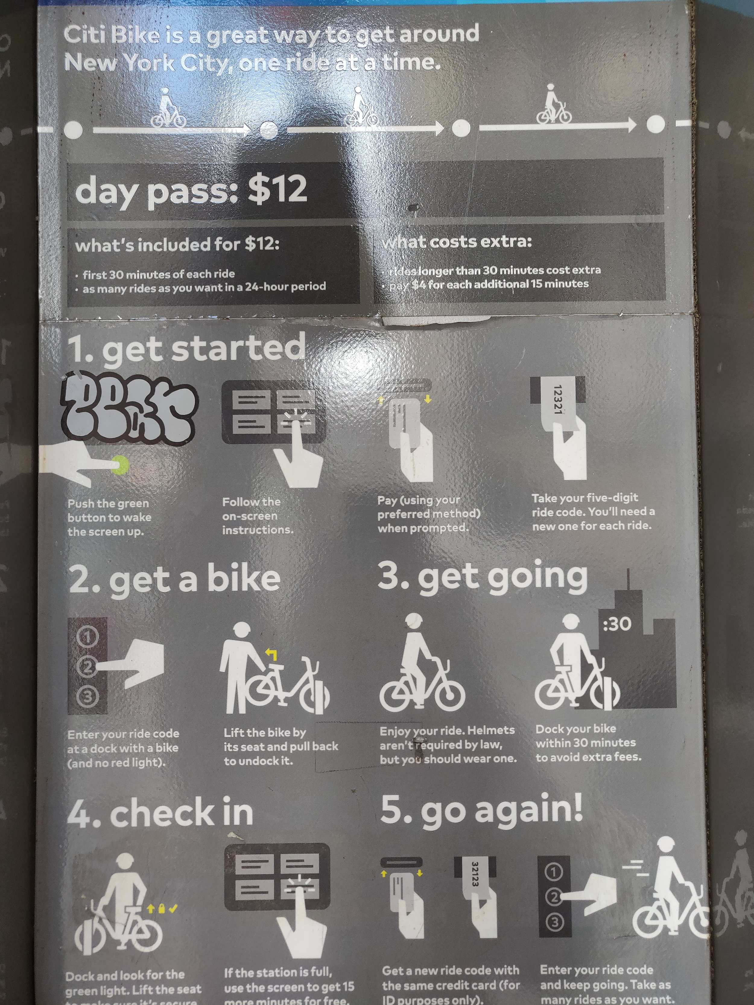
Step by step iconographic explanation.
The first thing that I noticed when I approached the kiosk is that the screen is locked and it is necessary to press the button in order to the information to be displayed, this could be easily solved with a sensor however I imagine that the energy saving is the main purpose of the designers decision to incorporate a pushbutton to turn on the screen. This interaction makes me think about mental models (as Don Norman mentioned in his book), New Yorkers (and probably tourists) are used to have the information available all the time, to have all the screens turned on and specially to be able to visualize the options in the screen since moment that they step in front of the screen, this is the case with Buses and MTA ticket dispensers, interactive maps, ATM, etc. Breaking the mental model might cause problems while encouraging new users to familiarize, accept and use a new product, such as a rental bike service.
I also noticed that the screen does give the option to display different languages, however, if a new user doesn’t push the button (maybe because the instructions are only in English) they might assume that the screen is only going to provide information in English as well, depriving a big amount of users from using the service.

City Bike in-kiosk digital interface
The next interface that the users need to deal with is the payment and ticket dispenser section. I noticed a big dissonance because the icons that I mentioned in the instructions actually have numbers assigned, however, those numbers are not related to any of the “steps” of the process. A better way to improve the accessibility and decrease the learning curve will be to assign those numbers to both the icons and the actual task, in that way it will be a visual correlation between instruction and action.
Moreover, the kiosks only take cards (not cash), which makes sense because they need a way to make sure that if the user keeps the bike for longer period of time, and extra fare will be charged, however this information is not visible in the kiosk and the ticket dispenser does look like a bill receiver (similar than the one is in people’s mental model). It is possible that some user try to pay with bills by inserting them in the ticket dispenser groove.

Payment Method
The last step of the process is to press the combination of numbers written in the card that was dispensed in the previous step. The interface to type those numbers is very easy and intuitive and the system guides the user in a very good way. However I noticed that the groove next to the numbers might confuse the users by thinking that they need to insert the printed ticket that they recently acquired from the kiosk.

Code and long term tickets reader.
The time that a familiarized used need to get a bike is between 50s and one minute (from the beginning that they turn on the screen until the moment where they successfully undock the bike from the station. This does not include the time for reading the instructions and following the steps. The estimate time that a new non familiarized user could take to undock a bike could go up to 3 minutes (however this will need a more detailed observation).
As a conclusion I believe the Citi Bike program is efficient for users who already know how to interact with the system, and those users normally get the unlocking digits from the mobile app due to the security of having control over the card information, and also because they normally use the app to find the station, therefore they are going to use the app either way. I also believe that the system could be very intimidating for new users but specially for tourists, the accessibility can be improved by making a more obvious visual (and ideally audible) correlation between the instructions and the tasks that need to be performed.