Quantifying Humanist Final Project: Quantifying my Guilt

For my final project of Quantified Humanists I wanted to collect, analyze and visualize data related to triggers of my emotional misbalance during the semester, I started by trying to quantify the quality of my meals, the exercise that I did and the guilt that I felt every time that I ate something unhealthy or I didn’t exercise.

At the very beginning of the project I realized that I wasn’t actually interested in counting how many days did I exercise or how healthy my meals were, instead I was interested in the emotional impact that those moments had in me. Thinking about how I felt every time that I did something “wrong” I realized the Guilt was the common denominator in all of those moments. I started to get interested in understanding why did I feel guilt, how much guilt did I feel and what triggered that guilt. The ultimate goal of that collection was to identify events that have a negative impact in my mental health and being able to mitigate them by finding ways to better deal with my everyday moments of guilt.

The project started with the data collection, in order to have a way to collect that was easy to implement and maintain over time, I created a Google doc, and I installed a shortcut in the home screen of my phone so that I would have easy access to it.

After I finished the data collection process, the Google Form provided me with a preview of the data visualized in a traditional way, I realized immediately that these visualizations were not able to give the the knowledge that I was seeking since they sere individual data points instead of being correlations of information.

I downloaded the data in a .csv file and converted it to a .son so that I could use it as an input to create different graphics using p5.js. The conversion process was important for me to be able to have a well structured data file with all the information collected.

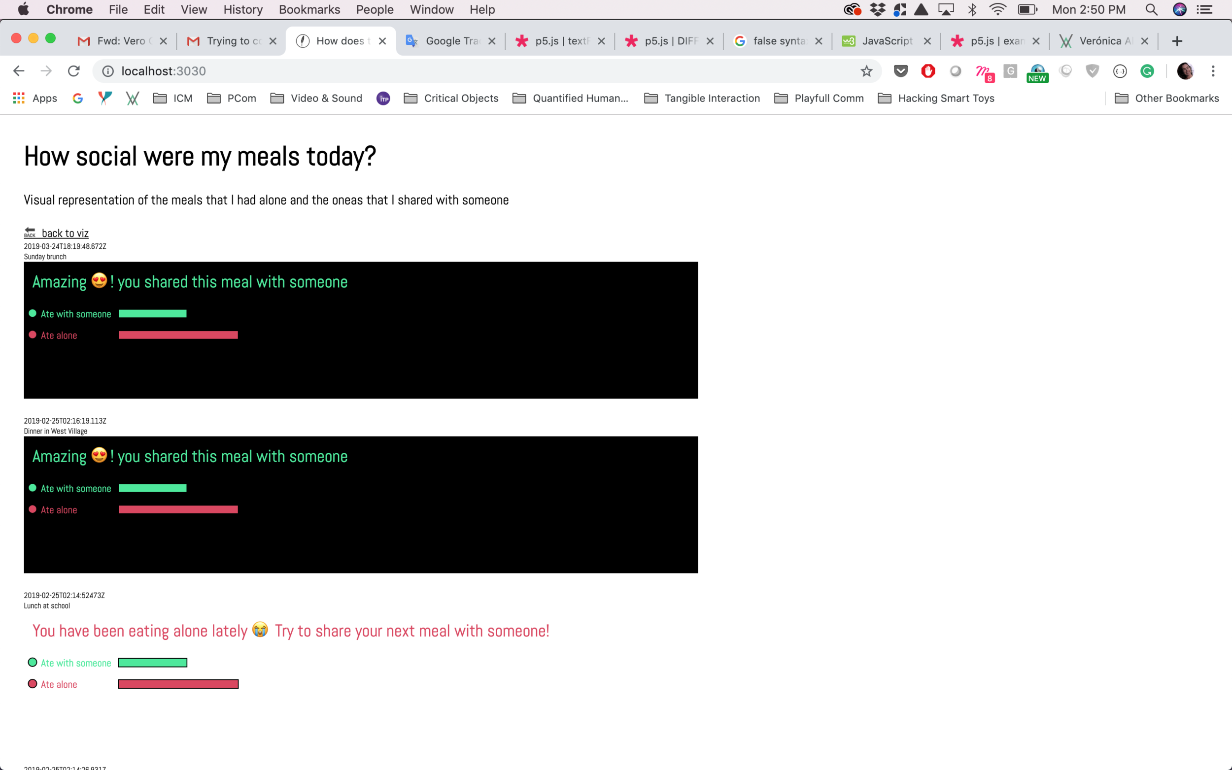
The first step of the design process was to sketch different ways in which the data could be visualized. Depending on the type of data and the correlations that I wanted to make (for example, trigger vs level of guilt) I created different ways of visualizing the data by using alternative graphics, different than just bar-charts or scatter plots.

After I decided which graphics to create and how to better visualize and correlate the information I started the development process in p5.js. I also created a in Sketch in which I defined the typography and the colors that I wanted to use in the sketch.

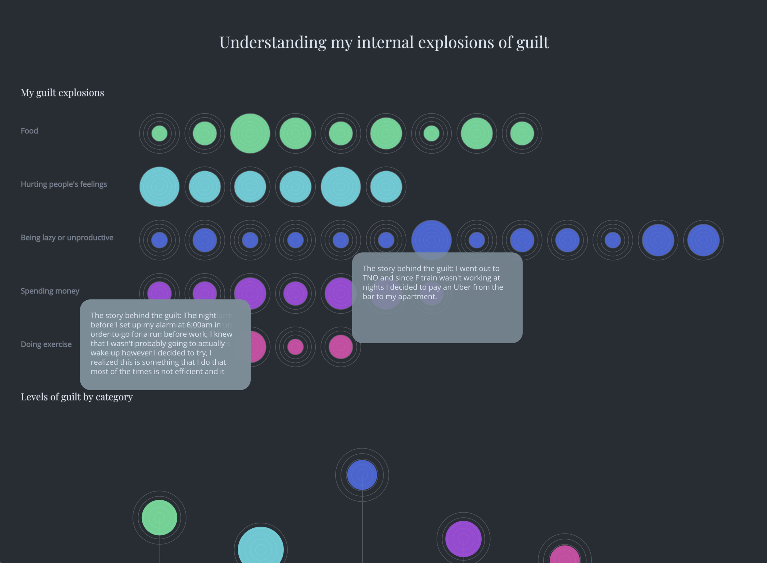
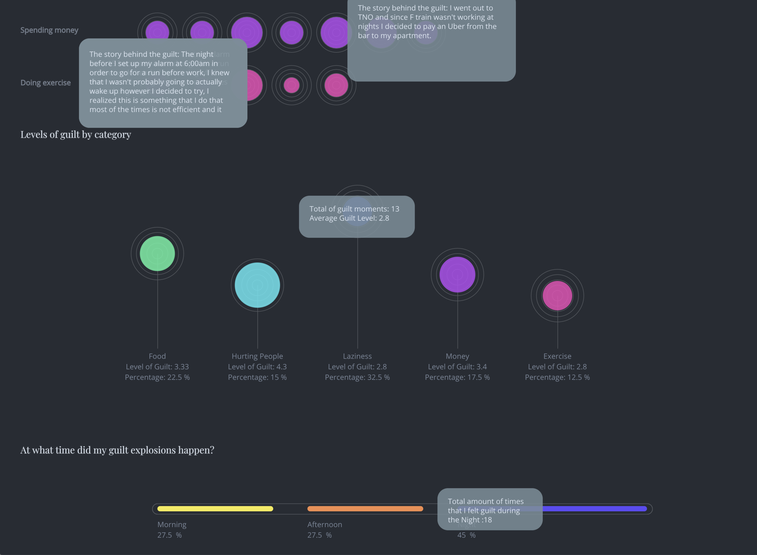
The final data visualization consists on three different charts and each one of them communicates a specific correlation of the previously collected information. The first chart shows all the individual moments of guilt (40 in total) and the strength (in a scale from 1 to 5) that I felt. I also used different colors to differentiate from each different trigger reason. The second chart shows an average of all the guilt moments by category and the strength to show how different those data points were between different triggers. Finally the third graphic shows the total amount and percentage of moments of guilt by time of the day, in general it is easier to understand that I normally feel more guilty during the night.

Final UI

I hope that this exploration of my feelings is going to help me prevent from having unjustified moments of guilt and hopefully be able to decrease the moments of guilt that I experience during the day and the negative effects in my mental health.

Data Intervention

For this weeks assignment I decided to work on top of the previous data collection and visualization app that I had adapted for correlating my feelings and emotions with the quality of the meals that I was eating and specifically in the aspect of eating alone vs eating with someone.

I wanted to create a way to quantify how many meals in total I have eaten alone and make a visual comparison vs the ones that I shared with someone and provide a message to encourage myself to try to share my meals more often since that is a good way to socialize and share conversation with friends during the day.

I started by creating a separate page for the “Intervention” that can be accesses from the home page where the individual visualizations for moods are stored. When the user clicks on “Intervention” the app will take him to a separate layout that will contain feedback on specifically the company on the meals.

Home page

Home page

The next step was to change the visualization of the grid since I wanted to eventually be able to create a horizontal bar chart. I added two different messages with changing colors according to the input that the user typed for the company field.

step1

Knowing that that might be a valid approach, I stylized the text and the icons to be similar than the icons used in the data input to be able to provide more consistency to the user.

Screen Shot 2019-03-24 at 7.07.42 PM.png

At this point I started to research how to create the bar charts with the data coming directly from the data input which was more complicated than I anticipated because checking for that number in p5 was not a good idea, therefore I had to go back to the database and the data collection in order to determine which numbers to use in order to create the bar chart.

Screen Shot 2019-03-25 at 2.50.02 PM.png

The last phase was to try to get the number of times that I ate with someone vs alone and compare it to the total amount of inputs. With that information I could visualize in the p5,js sketch or directly into the js file where I was receiving that data.

Screen Shot 2019-03-27 at 9.46.27 PM.png
Screen Shot 2019-03-27 at 9.46.38 PM.png

The end goal of my intervention was to be able to visualize if I was eating alone too many times in a row so that I could try to be more social during my meal times and hopefully improve my moods and feelings about the meal times.

I ended up breaking the sketch and I definitely believe that I was trying something way out of my knowledge, therefore I will continue with this idea for my final project and hopefully find a way to collect and visualize the information in the correct way.

Data Selfie and Express tutorial

For this week we had two different assignments, the first one was to run the data selfie app and try to make some changes to it and the second one was to complete the express tutorial. I decided to dedicate more time to slowly go throw the express tutorial and be able to understand what I was doing. My goal was to reach the end of the tutorial by having an overall understanding of what I was doing and how I might use this in future projects.

I started with the Data Selfie project, I ran it, deleted Joey’s (very funny) selfies from the db document in order to be able to populate it with only my selfies.

Deleting Joey's selfies from db

Deleting Joey's selfies from db

I didn’t know if I was going to be able to add a new element to the form therefore I decided to start by creating a concept around the selfie collection and change the colors of the font and background. I started by collecting selfies every time I was feeling like I didn’t know what I was doing (I probably escaped a lot of those moments).

Weird selfies collection

Weird selfies collection

Since I have been trying to keep track of how I feel around food and how it makes me feel, I decided to use the selfie collection to track the moments when I feel “Hangry”, a combination between being hungry and angry, which happens very frequently since I tend to eat a lot of snacks, however sometimes I just stay at the floor and for different reasons, end up being hungry in front of the computer. I decided to collect those moments and document them with a selfie and a reason (text input) for me to indicate the app why am I hungry? what is the reason why? Did I escape a meal time? did I forget my food at home?, did I get too invested in a project and I forgot to buy lunch? (and the list continues….).

New data input

New data input

I also change the text instructions for the data collection and I added a text field with a placeholder indicating: “Why are you hangry?”. This is how the data collection screen looks like:

Data log + new text field

Data log + new text field

I didn’t continue focussing on this assignment because I wanted to dedicate more time to the Express tutorial, which I found very clear and I followed until the end. It was very interesting to see how powerful creating my own API can feel and the amount of possibilities that I have now with this new tools. These are some screenshots from the Express tutorial.

Express tutorial using postman

Express tutorial using postman

Running the p5.js sketch

Running the p5.js sketch

Quantifying my feelings around food

For this week’s assignment I decided to start working on an idea that I would like to develop for the final project of the course, start understanding how to manipulate the data visualization and the importance of collecting meaningful data in order to self track myself and make behavioral changes according to the knowledge acquired by doing this exercise.

I consider myself as a healthy person, who loves exercising and eating healthy food, but at the same time I enjoy exploring different restaurants, new food and experiencing places throw food. I have noticed that since I moved to NY, and obviously changed my lifestyle, it is more difficult to dedicate time to exercise and cook healthy meals which have been affecting my emotional health.

Read More

Quantifying Data: A week in Compliments

For this week’s assignment we had to quantify a specific aspect of our lives, I decided to work with Anna Gudason by counting the amount of compliments that we received during the week, the reason why we did this is because we believe but a lot of time we don’t share what we are thinking, specifically in my case, if I see someone wearing a nice outfit I try to say something nice, however I don’t always do it, or if someone is beating him or herself up because something went wrong with an assignment, I try to give support however I don’t tend to compliment their good characteristics. By quantifying the compliments that we received we figured it will also be interesting to know how many we give during the week and be able to create a visual comparison.

A very important aspect was the collection of the data, I started by creating a spreadsheet in Google docs so that I would always have access both in my computer and in my phone, in order to be able to track more efficiently and hopefully don’t forget to log any of the compliments. The structure of the data collected was, I had a separate sheet for each day, and I had two different columns with “Compliments given” vs “Compliments received”.

Read More

Quantified Humanists Week1

Part 1: Data Double

This is a documentation of a series of online services that contain data about how I interact with technology, the purpose of this blog post is to be accountable about the data that I have requested and the data that I have been able to collect during the first week of class.

So far I have requested data from the following services:

  • Clue

  • Instagram

  • Gmail

  • Youtube

  • Google Maps

  • Strava

  • Facebook

  • Amazon

Interesting Findings: The Information architecture of the websites and services is specifically designed to make it harder to the user to request the data. It was a long process only to be able to find a link to request the information and most of them took a long wait time to receive. I also notices that some of the emails didn’t arrive in my main “received” emails, instead they arrived to t he “promotions” tab which gave me problems because some of the links (like LinkedIn) expired before I could download it.

In the case of Facebook data it is interesting to see a json file with my “ad interests” and I am curious to explore and visualize this kind of information. It was also interesting (and very distracting) to see all the pictures that I have ever uploaded to the platform, even the ones that are no longer visible in my profile.

The most interesting package was definitely the Google one, which allowed me to download Youtube, Maps, Gmail and pictures all at once. It was very weird to start looking at the pictures because it contains very old pictures that I never uploaded anywhere but were probably part of an email or a conversation.

I am still waiting to receive data from the following services:

  • LinkedIn

  • Spotify

I need to request data from the following services:

  • CityMapper

  • Lyft

  • Venmo

  • Eventbrite

Part 2: Self-Tracking Projects Review

Project1: Clue app

Clue is a female health app developed by the Berlin-based technology company BioWink GmbH. It calculates and predicts a user's period, fertile window, and premenstrual syndrome. It also informs users the most or least likely time for becoming pregnant and allows them to track more than 30 health categories, including sex, sleep, pain, exercise, hair, skin, digestion, emotions and energy.

The UI of the app is very simple and intuitive which encourages the user to submit and track the data however I believe that the most important feature of the app is that it gives the women a very accurate and actionable data visualization. For example if I am consistent (which I try to do), I will have a notification normally two days before I get my period, which helps me be prepared. It also indicated me when I am in more fertile so that I can avoid having sex if I don’t want to have kids in this moment.

Photo credit: helloclue.com

Photo credit: helloclue.com

The project is important for me because it has helped me track my period and my mood changes and understant my body in a better way. I am aware that the fact that I keep tracking my data is mostly influenced by the good data visualization design and the accuracy of the information and knowledge that I am able to extract from the “numbers” that I input every month as tabs in the screen.

Project 2: Bruises — The Data We Don’t See

Bruises is a data visualization that uses graphics and music to display the clinical and emotional data from a patient with the Idiopathic thrombocytopenic purpura (ITP) condition. The project was developed by Georgia Lupi in collaboration with Kaki King.

It all started when Kaki discovered blood in her 3 year old daughter and when she hospitalized her the doctors diagnosed her the condition. In that moment Kaki communicated the sad news to her friend Georgia, who decided to start a project to be able to track the progress of the illness from the clinical side but also the emotional implications on Kaki.

“The doctor’s directive to us was to watch her skin for any significant changes. Since I had been working with Giorgia I had learned to do personal data collection, so I began to write down what I was seeing on Cooper’s skin, what activities we did that day, what treatments she had and what her reading were, as well as how I was feeling. My fear, stress, my hope. My thoughts and feelings.” —Kaki King

The project uses graphical elements that are displayed over time showing information collected such as: Skin, medications, platelet count (from Kaki’s daughter) and also tracks the hope/stress experimented by Kaki.

Bruises Project by Georgia LupiPhoto Credit: Georgia Lupi Bruises

Bruises Project by Georgia Lupi

Photo Credit: Georgia Lupi Bruises

This project is of great interest to me because it uses data to communicate a story but specially it works for the purpose of documenting the progress or the clinical conditions in a very unexpected way. Normally the graphics that a doctor shows a patient are scary and meaningless however Georgia’s and Kaki’s graph is a visual representation of pain, suffering and hope in a very beautiful and expressive way.

I also believe that this kind of data visualization needs to have a narrator, it is not possible to fully understand the chart by only looking and reading at it, therefore the uses of this kind of visualization will never replace the more clinical and accurate data visualization however it works as an emotional reinforcement for storytelling.

Project 3: Garmin Connect + Strava

The third project that I would like to analyze is a combination of technologies for fitness tracking that I have been using for almost two years and I would like to analyze the positive and negative implications of using these technologies and how they have had an impact on the way that I train and exercise over time.

I have a Garmin watch for Triathlon (even though I am not one) and I use it with the mobile app “Garmin Connect”. When I was part of a running team back in Costa Rica my coach would assign training sessions to me and I was able to follow them by tracking my heart rate during the time I was running. At the end of each training session I would upload it to Garmin connect and that would give my coach the possibility to analyze how my performance was and how it compared with previous sessions.

The fact that Garmin Connect allows the user to visualize the data in a graphic way and save the training sessions is very useful to track the progress, the app and the watch will also give notifications when the user achieve a new record which sometimes helps motivating and encouraging a better performance.

Garmin and Strava mobile appsImage credit: Connect.garmin

Garmin and Strava mobile apps

Image credit: Connect.garmin

Image Credit: road.cc

Image Credit: road.cc

I have also used Strava connected to my device and specifically the social component, I used with my ex co-workers for an internal competition in my previous company, in which we would track the miles that we run, biked and swam in order to choose a winner at the end of each month. The social component of Strava was very interesting and it was a way to keep us accountable.

Also an interesting use case that we gave Strava as a remote team (working from India, Costa Rica and US) was to be able to see the maps and roads of the other coworkers and be able to leave comments and motivate them to keep training or challenge them for specific races.

I also wanted to comment what happened when the GPS of my Garmin failed and I had to go back to training with no tracking at all. It was a very interesting experience and it gave me the possibility to enjoy physical activity for how it made me feel instead of only focussing on the numbers and the graphics. I got my Garmin back a couple of weeks ago and it aligned with the beginning of this class therefore I decided to go back to tracking my activities, steps and sleep. This time my goal is to use technology as a complimentary indicator of my wellbeing and physical performance instead of leaving all the responsibility in the data collection and visualization.

Part 3: Reflection

I believe I have already used this assignment as a reflection of my relationship with self tracking devices and technologies, however I would like to expand on a couple of issues that I have found and how I hope to improve them by continuing self tracking.

In general I use self tracking (consciously) for my fertile cycle and for my fitness and activities. This might be a little bit too personal information however I believe it is important to expand on my relationship with self tracking. I mentioned in the first example above that I use the Clue app to track my period, the pain and emotions that it causes in my body and mind. I recently got an IUD as a fertility method however I want to keep using Clue as a way to track how my period behaves (even though it is now controlled by hormones) and how my feelings and emotions are going to change now that I have this device that is constantly providing my body with hormones. I believe that this app have the potential to be able to identify if there are weird behaviors in my body (specially during the first six months of having the device) therefore I want to continue my tracking using Clue and getting meaningful feedback from the data visualization of my cycle.

In the side of the fitness tracking, I would like to give my Garmin watch an adequate use and be able to extract meaningful knowledge out of the numeric data collection, I have experienced before a lack of engagement because I was only collecting data but not letting my body communicate by itself. This time I would like to use the technology as a mean of expanding the signals that my body is giving me instead of using data as the main point of focus.

My hopes with self tracking are to start being more conscious about how I eat and exercise and how that affects my emotions, I would also like to track how many times during the week I eat home cooked meals vs street food or restaurants (I would like to keep track of this both for health and financial reasons). I am very interested in the intersections of self tracking with different approaches and how that might give me a better understanding of the relationship between my body and my emotions.

The beggining of this interest started last semester (1 year at ITP), when I started having panic attacks, this has never happened before and I don’t have a clear understanding of what triggers them and how could I prevent them from happening. I believe that it is a combination of many different reasons that trigger such condition such as lack of sleep, high levels of stress caused by school assignments, interaction with new people and also the lack of physical activity. I believe that self tracking some of this behaviors might be a very interesting project to understand how my mind is reacting to my new daily routine and how can I improve the way I live now.

I don’t in data collection and data visualization for the sake of it and I am not that interested in visualizations that are too complex that need to be explained (like some of the Georgia Lupi’s projects), instead I am interested in the analysis and simplification of data to provide meaningful knowledge and actionable items to improve people’s lives.